Making traveler experiences better with a digital app.
What is Windows to Japan?
Windows to Japan is a travel company that provides customized tours to inbound travellers to Japan (I used
to work there!).
Their primary focus is planning tours, booking hotels and activities for their clients, and giving
them physical travel files once they arrive in Japan. Windows to Japan also supports clients
during their stay in the case of emergencies or just for general questions.
Objective
Design an end-to-end travel application that replaces the physical travel files.
Provide a seamless experience for their clients through simplifying the process, providing real
time support, and enhancing personalization.
Client:
Windows to Japan (Volunteer)
Roles:
UX/UI designer & researcher
Tools:
Figma, Miro, Whimsical, Maze
Challenges
Itineraries are usually overloaded with important information. How might we simplify the
contents when there is a lot of information?
Physical documents and digital apps bring users different experiences. How might we digitally
optimize text-heavy physical documents?
Solution 1
Streamlined main page that automatically syncs with your time zone.
Simple and to-the-point design that delivers clear messages to the users.
Solution 2
Easier scanning with "read more" button & a chat feature for quick help.
You decide how much to read and learn. Let our chat bot take care of your hassles.
01. Research
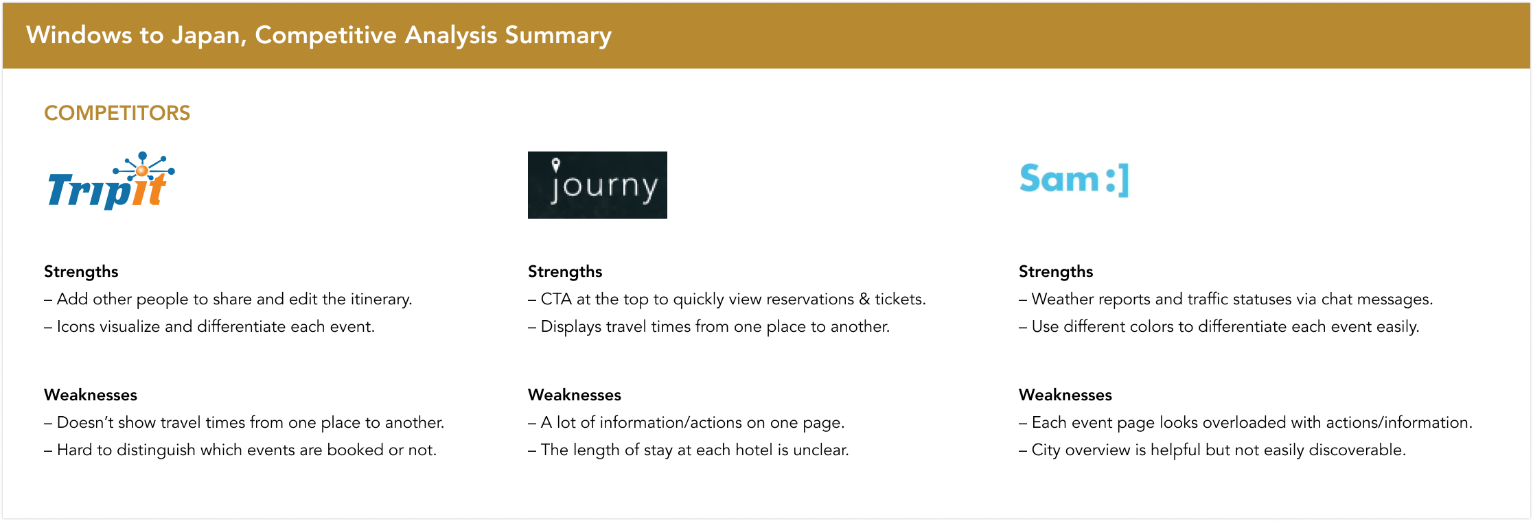
Competitive analysis
To start with, I was curious how other travel agencies transitioned from providing physical documents to their
clients to
providing a full mobile experience. However, I couldn’t find any competitors doing this. Instead, I picked three
indirect competitors and analyzed their app features. Some of them have similar features to what I
envisioned,
such as a chat bot and access to travel agents within the app. This gave me some ideas of how to design
an app
with an integrated chat bot.
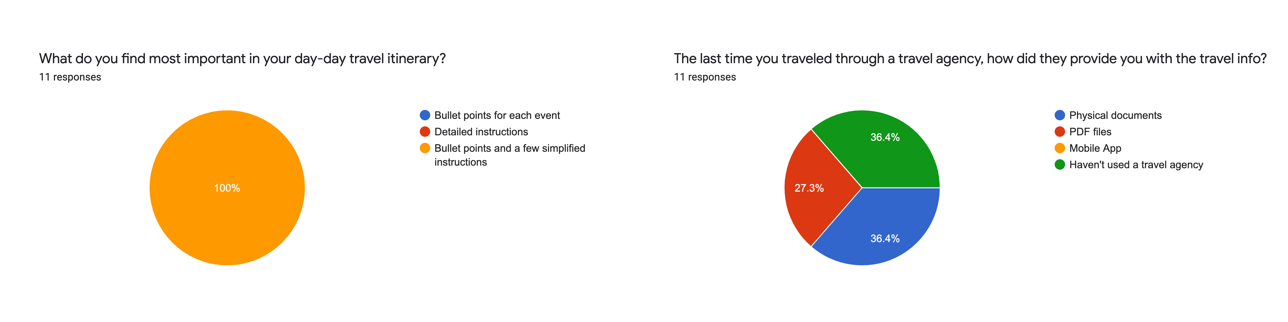
Survey
Now that I had some ideas of how I would organize and design the app, I wanted to include the users in my
design. In order to do that, I started with a survey to learn about the frustrations and needs that
people have
when using travel apps.
I focused the survey on travel apps rather than travel agencies in order to get a sense of what patterns and
formats people find useful in a digital platform. From the survey, the main thing I learned is that all the
participants prefer bullet points and simplified instructions. Gathering this feedback helped me to
prioritize
features for the Windows to Japan app.
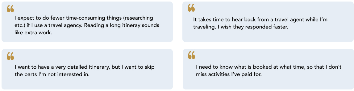
1:1 User Interviews
Once I gathered quantitative feedback on travel apps, I was curious what travel agency users have to say.
Specifically, I wanted to discover the frustrations and needs people have when 1) using PDF or printed
itineraries and 2) when connecting with an agent when a problem arises. From these interviews, I learned
that all of the participants prefer having detailed itineraries, but they also want to easily skip
uninteresting parts. This matched the feedback I received from the survey: all the survey
participants want
a detailed itinerary but in a simple format.
Here are the major needs and pain points I collected from the user interviews:
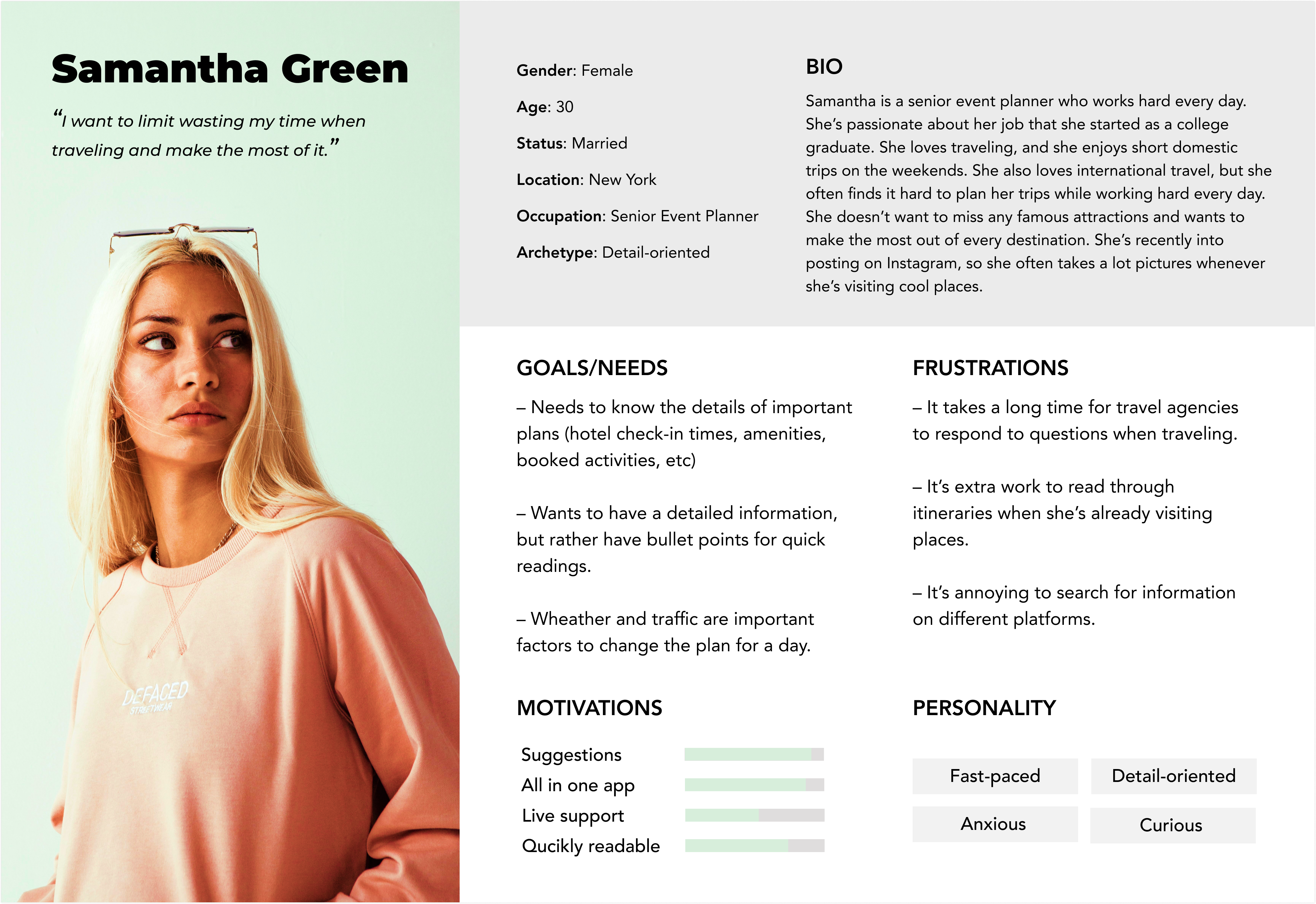
02. Define
Persona
In order to keep in mind who I'm designing this app for, I summarized the important feedback into a single
persona, representing a core user.
I was able to quickly refer back to this persona during the whole design process, which helped me make
user-centered decisions.
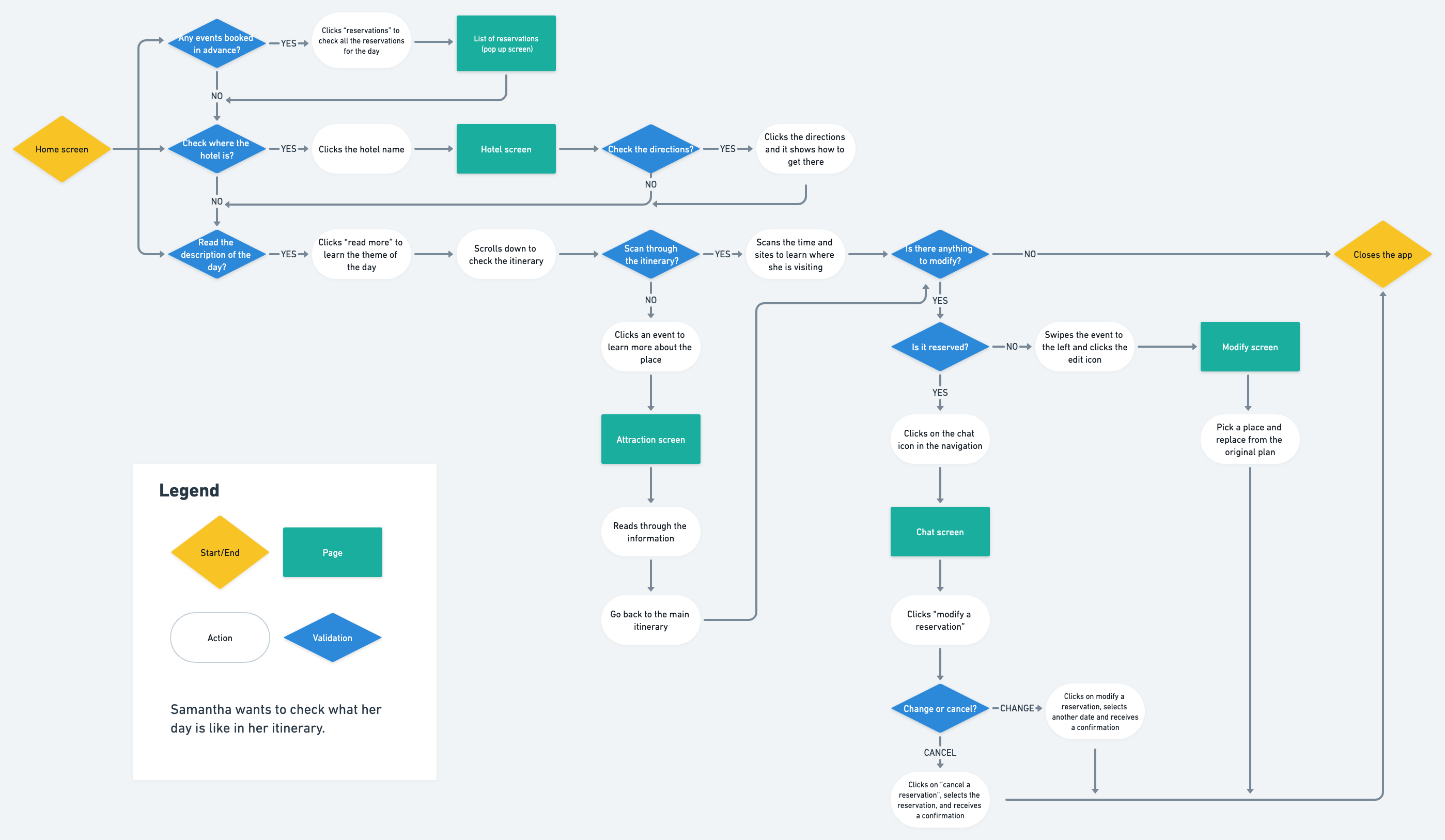
User Flow
After I established the persona, I wanted to know more about the users–how they navigate the website in order to
complete tasks. I decided to make a user flow in order to visualize how and when a user would take actions
and
navigate through the app. I was able to understand which part of the app would be complicated and need
extra
attention. With this flow clearly laid out, it makes it much easier to design a seamless user experience.
03. Design
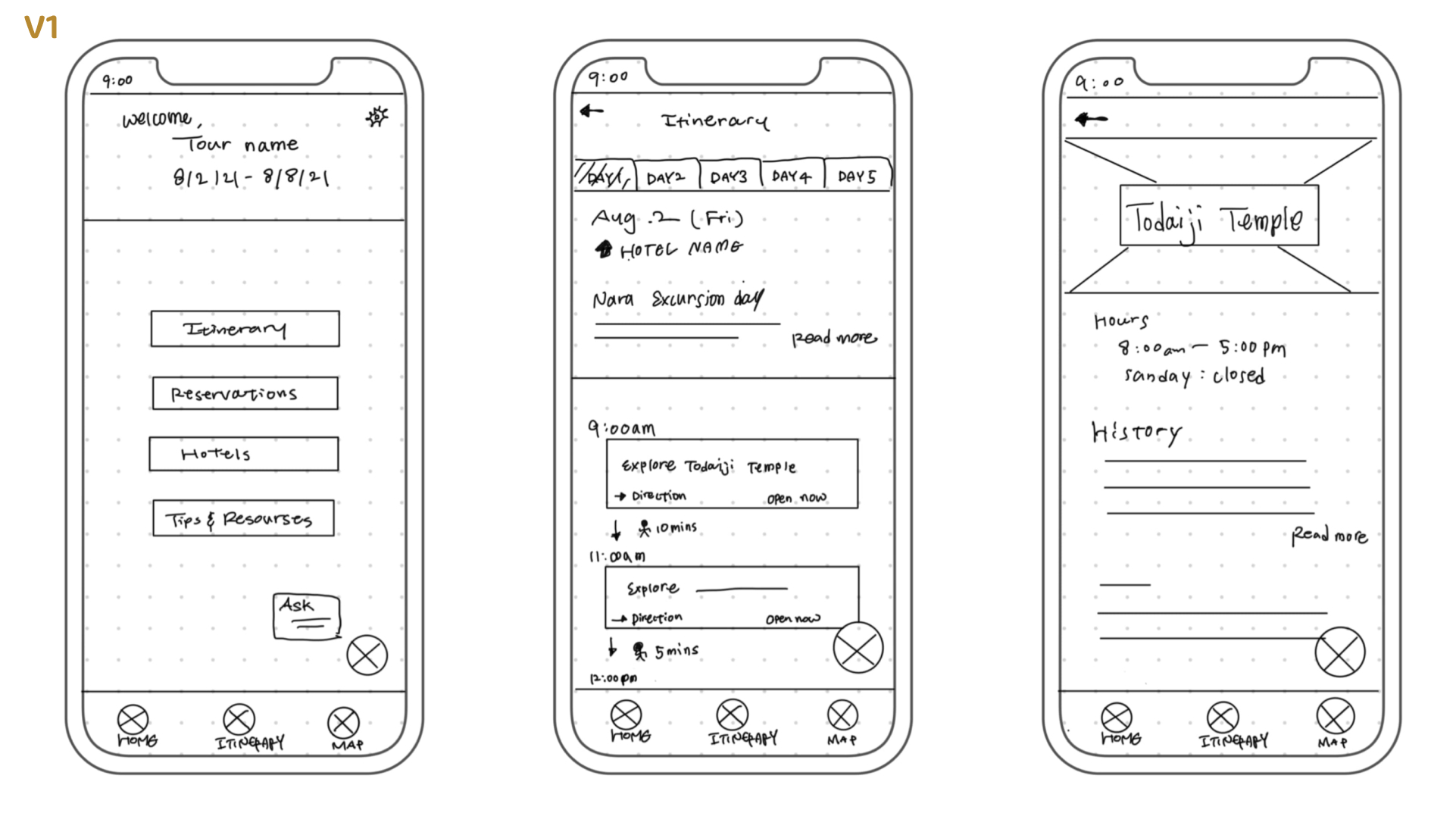
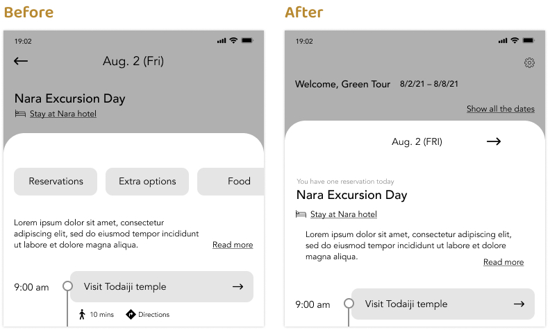
Sketches
Before designing any wireframes, I decided to sketch the layout of the app to solidify my rough ideas. I
sketched one version first to combine the ideas of the app layout I got from my competitive analysis and
inspirations.
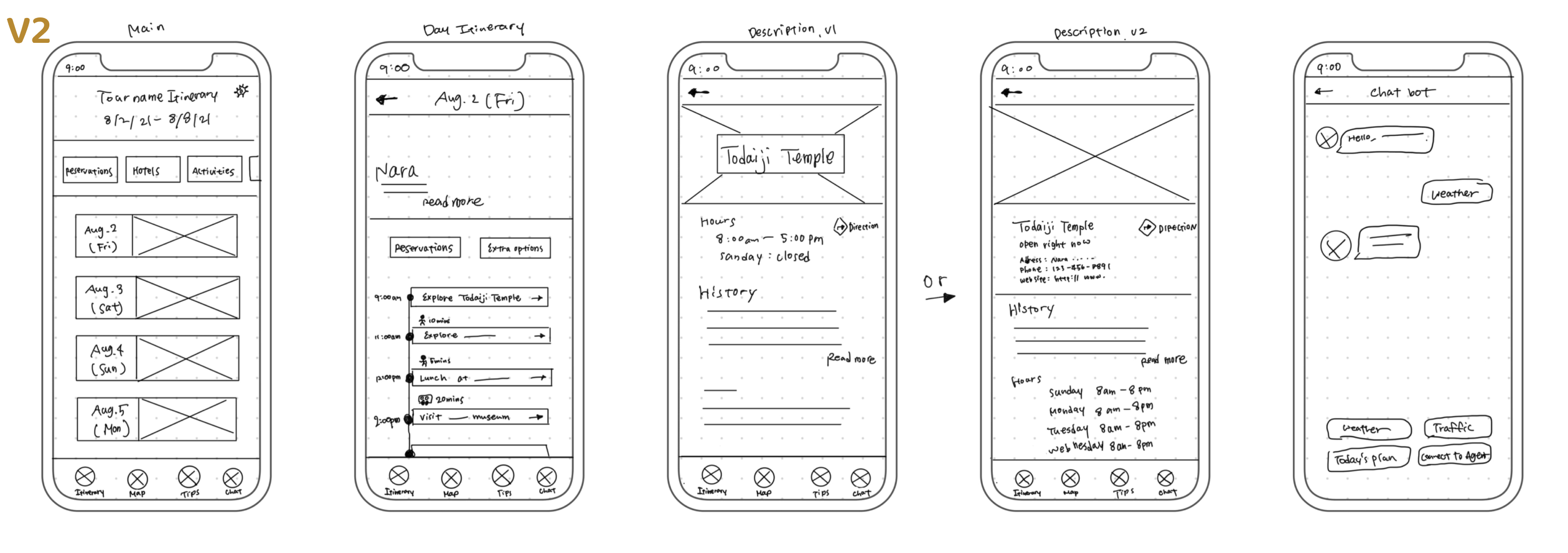
Then I sketched a second version with an improved layout, including a simpler itinerary page that is easier to
parse. I focused on the itinerary page since that’s the page that users will be looking at more than other
pages.
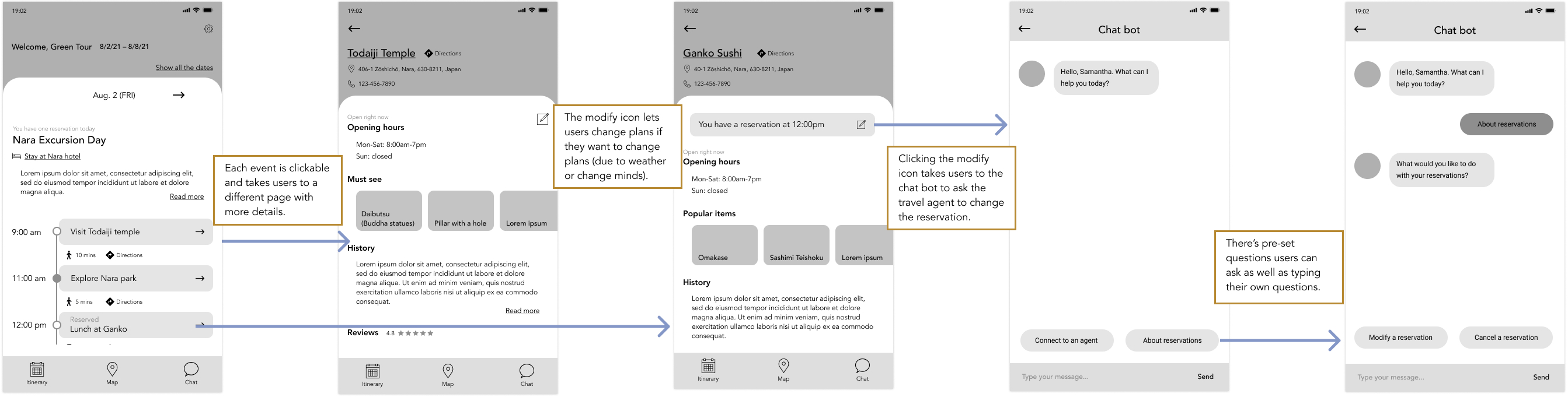
Mid-Fidelity Wireframes
Next I created mid-fidelity wireframes to focus on the app's usability before making the final designs. While
creating these wireframes, I focused on the flow of the app, looking for anything I could iterate on. Here are
the final wireframes.
After finishing the first version of wireframes, I realized that it was somewhat confusing to navigate myself,
due to visual clutter. I iterated on the design to make it more intuitive by removing unnecessary
features.
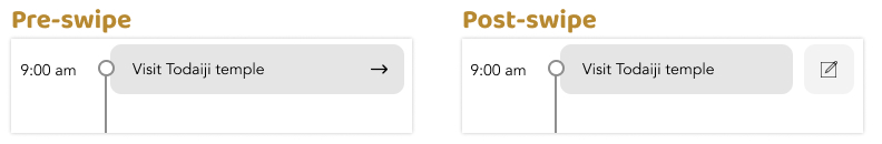
There was one thing I was unsure about, which was whether the swiping effect for events was clear.
Instead of
iterating on it immediately, I opted to conduct usability testing on it, along with the entire flow.
Mid-fidelity Prototype and Usability Test
View Prototype
As mentioned above, I decided to conduct usability testing to receive feedback on the swiping effect before
making hi-fidelity designs. I used two formats:
Zoom (2 participants)
Maze (7 participants)
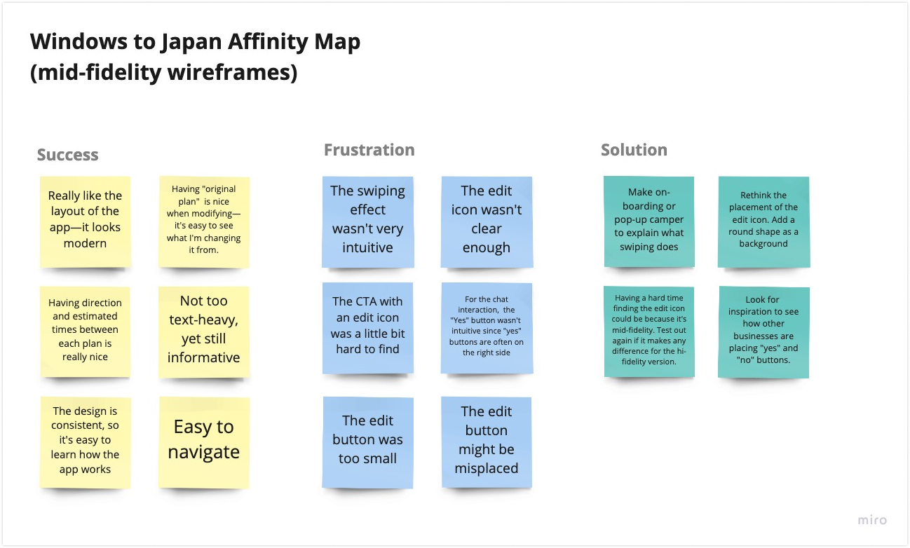
Affinity Map
I created the affinity map below to summarize user feedback and see what can be improved. Through the usability
testing I verified that the majority of people found the swiping effect unintuitive. In addition to that,
several participants mentioned that the edit icon was hard to find. I was glad to test the wireframes at
this point since I would have not known the edit icon was hard to find.
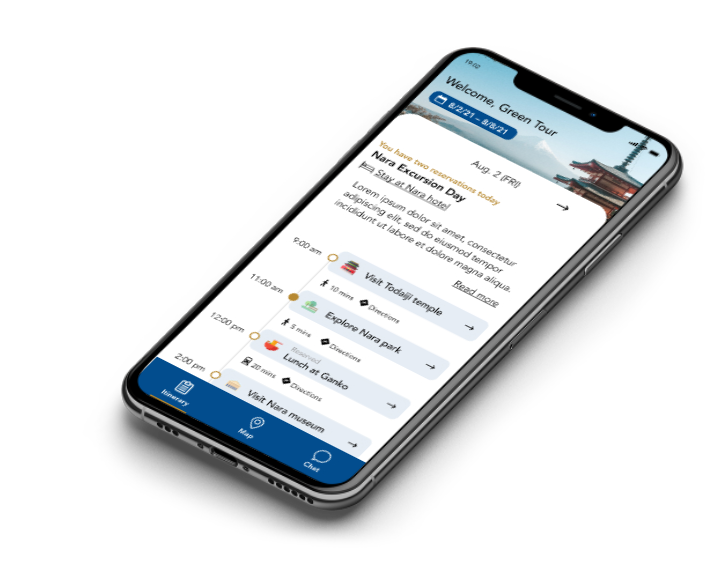
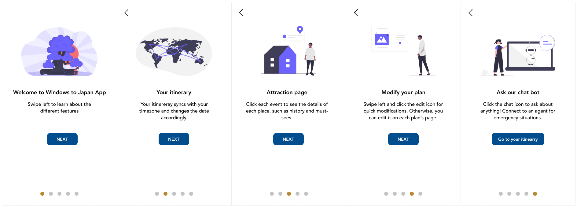
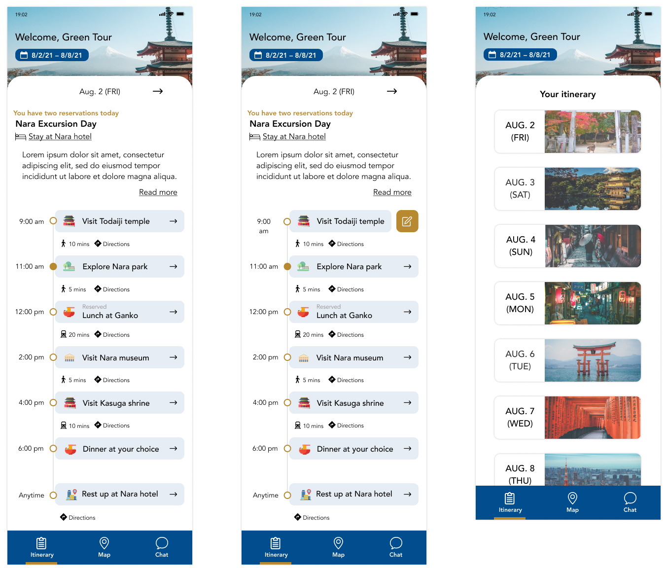
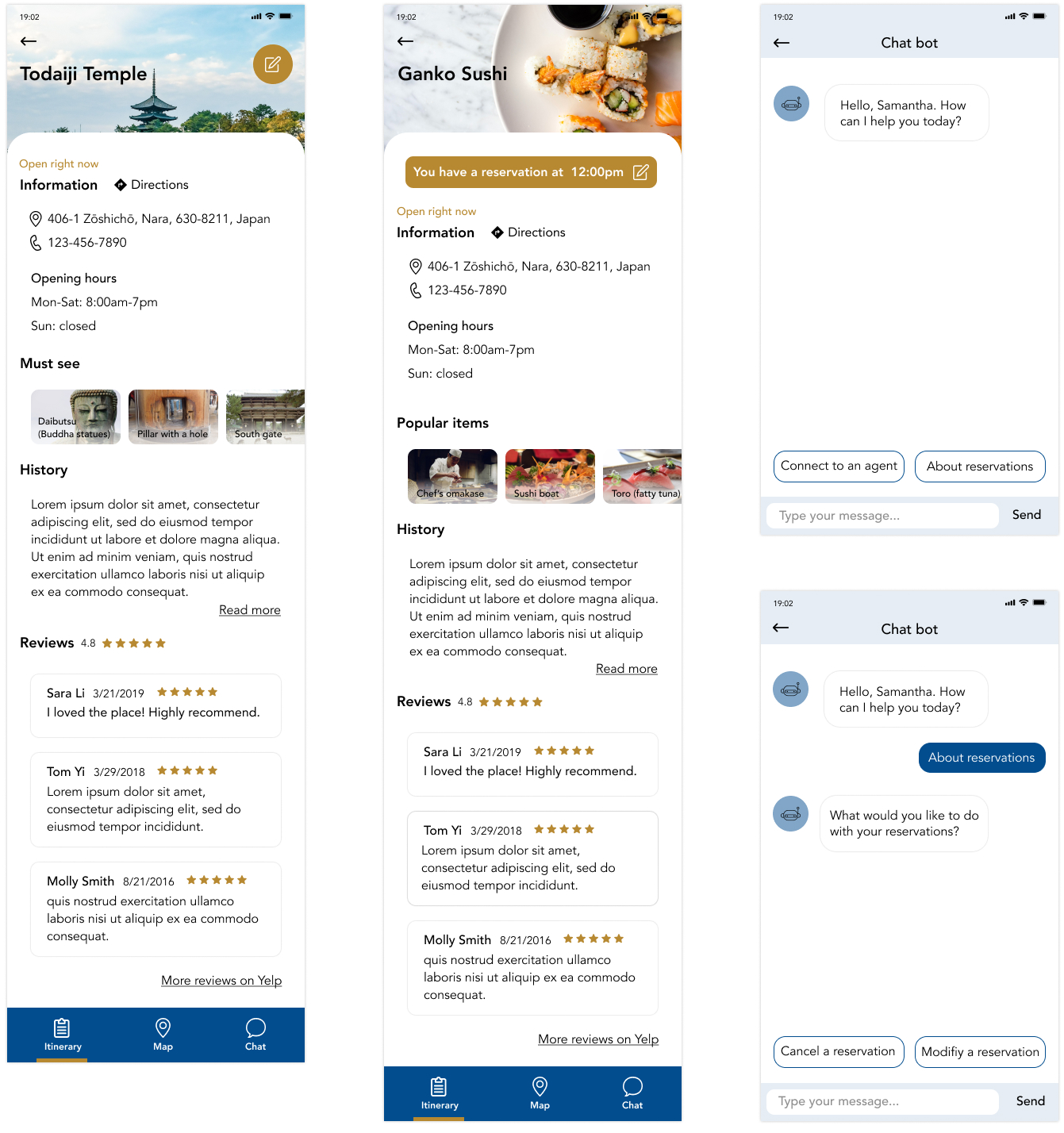
Hi-Fidelity End-to-End Design
I worked on hi-fidelity designs based on the wireframes and feedback I received from the usability testing in
the previous process. I added onboarding so that users know how the app works.
Since travel itineraries on physical paper are usually overloaded with information, I
aimed to make the design not text-heavy but still include all the important details. I focused on making
the interface (edit icons, CTA buttons) clean and understandable. While iterating on the hi-fidelity wireframes,
I
realized the font sizes were very small (12-14px), so I made them larger (16px).
I decided to visually differenciate each event in the itinerary so I used icons to show what it is specifically
represents Japan.
I also made the edit buttons easy to find by using a different color from other colors. I also moved up the edit
icon in the Todaiji Temple screen since users had a hard time finding it. If an event is reserved in advance
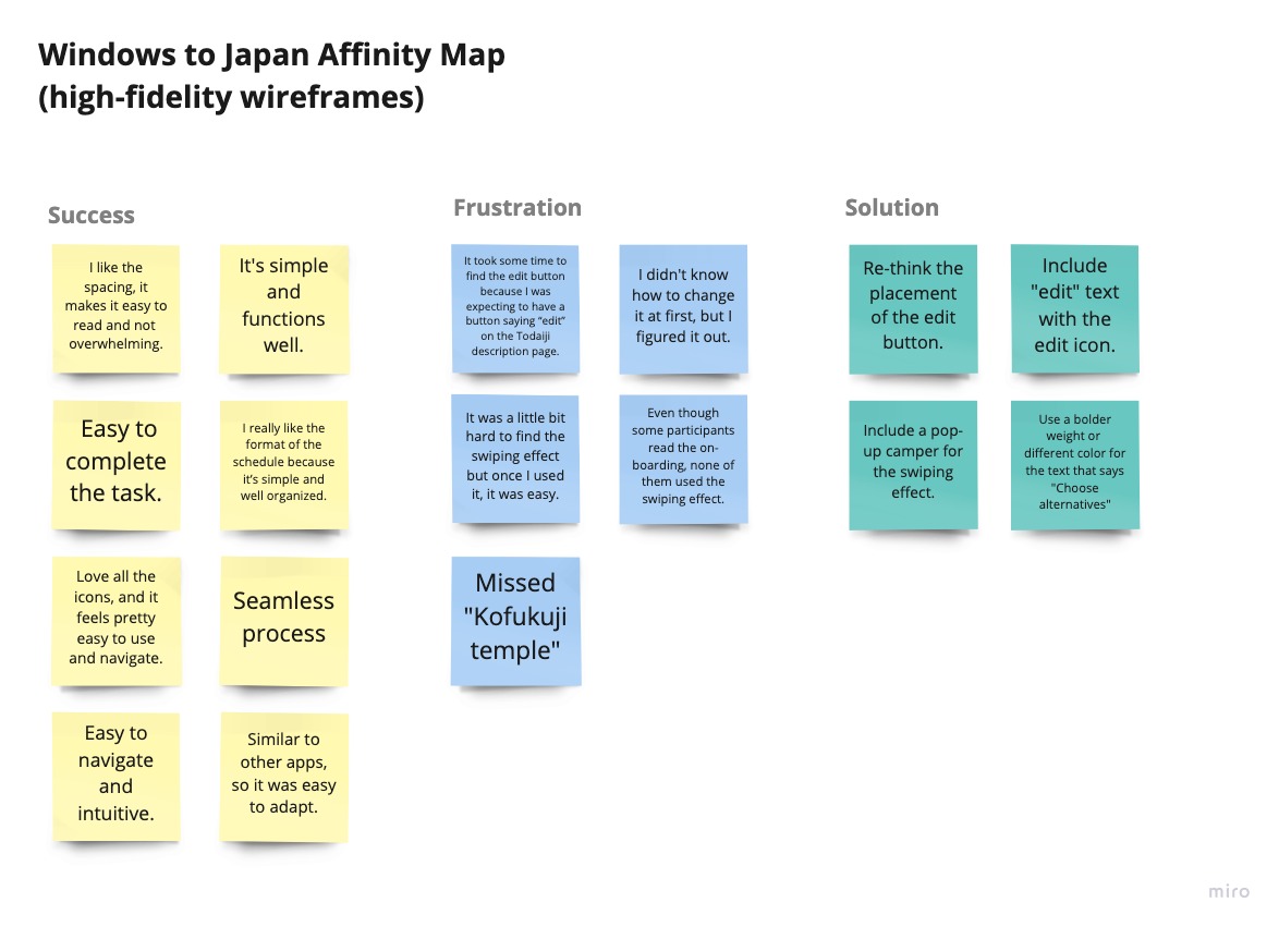
I decided to conduct another usability test to see if hi-fidelity wireframes solved the problems in the
mid-fidelity wireframes. I also wanted to see if there's anything else that could be improved in the design
and use of icons and colors.
Zoom (4 participants)
Maze (13 participants)
Affinity Map
Since I recruited more participants this time, usability testing revealed more feedback that helped me to see my
design objectively. I wanted to make an affinity map again to summarize the user feedback and organize
them.
This helped me to realize what I need to work on to make the design better.
Priority Revision
After testing the app design, I was able to understand what was making users confused about the design. I wanted
to make revisions since both the edit button and swiping effect weren't clear enough. Apart from the
frustrations, I received a lot of good feedback about the app providing a detailed yet simple interface, which
is what I was trying to achieve.
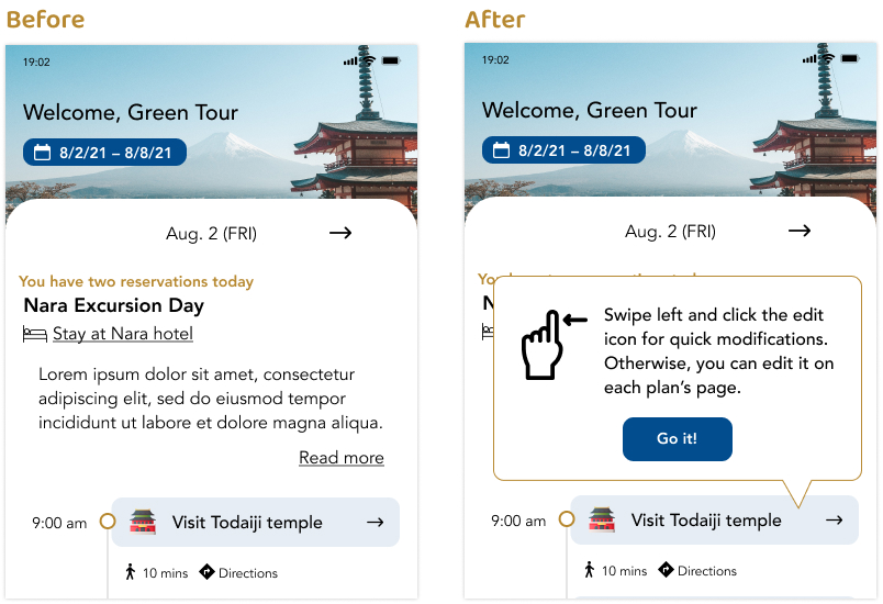
Through usability testing of the mid-fidelity wireframes, I learned that it wasn't intuitive to swipe
an
event without any explanations. For this reason, I decided to include on-boarding screens in the
hi-fidelity designs to make people aware of the feature. In the hi-fidelity usability testing, I
learned
people still didn't realize they could swipe even though some participants read the whole
on-boarding
screens (in the Zoom usability test). I didn't want the feature to be undiscoverable, so I
decided to
include a pop-up screen on the itinerary page to get users' attention.
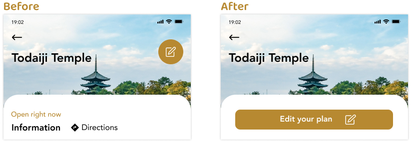
From the mid-fidelity usability test I knew that the edit icon was hard to find. I tried making it more
obvious in the hi-fidelity designs, the participants still had a hard time finding it. I received some
feedback saying it's better to have text saying "edit" or "modify", so I decided to have both the
icon
and text. Additionally, I moved it onto the card and enlarged it to be more prominent.
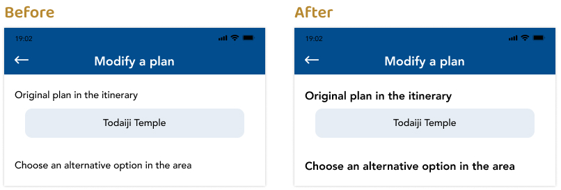
One of the participants struggled when asked to modify a plan, despite there being clear directions. I
realized that the text was not noticeable, so I changed the text size from 14px to 16px and bolded it
for better readability.
Takeaways
Usability testing is very important. It was my first time conducting usability testing on wireframes,
and I
realized how important it is to have users involved throughout the whole process.
Don't assume users will understand a feature just by its icon. Feel free to add a description to tell users
how it works.
When designing on a large screen, be aware that readable text may not be readable on smaller phone screens.