What is 1 Thing Against Racism?
1 Thing Against Racism was founded in response to the increased racism against Asians due to the Pandemic.
Many people have feelings of anger or fear, yet are hesitant to take action. 1 Thing Against Racism is a
non-profit organization that is trying to mobilize all Asians and allies to stand up and fight against
racism together.
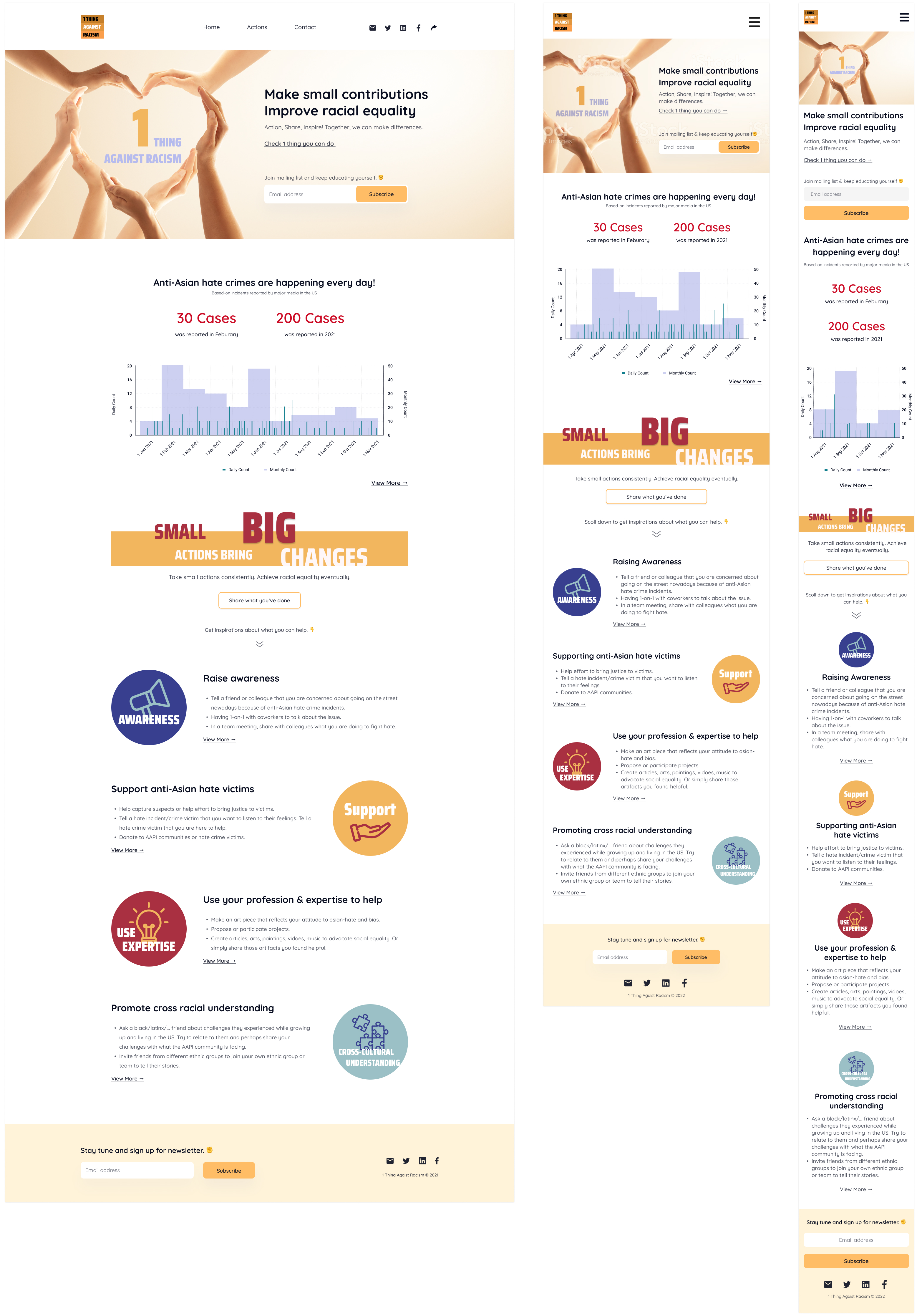
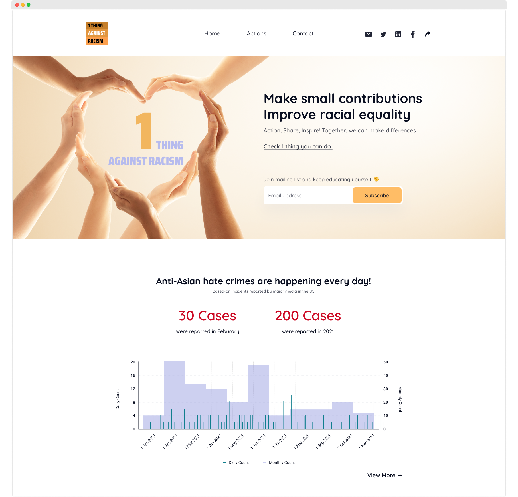
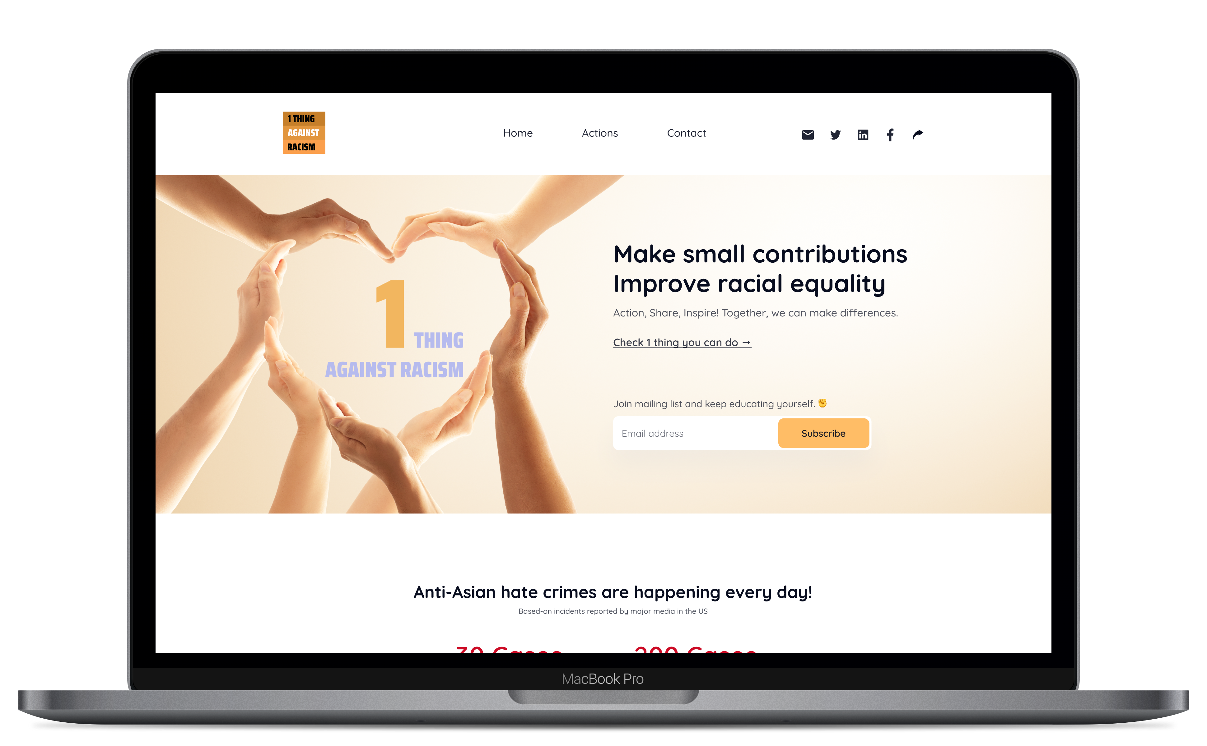
Design a website to start spreading awareness about Aisan Racism.
Create an educational website to learn about racism and Asian culture in an approachable and
friendly way.
2 other designers, 3 developers
Websites about Anti-Racism usually look serious and aggresive. How might we make it
approachable so that we are not demanding that people be open-minded?
People usually don't know what to do or where to go to give their support. How might we create a place to learn and connect with other supporters?
Objective
Role:
UX/UI designer
Tools:
Figma
Team:
Kotomi Cogdill, 2 other designers, 3 developers
Challenges
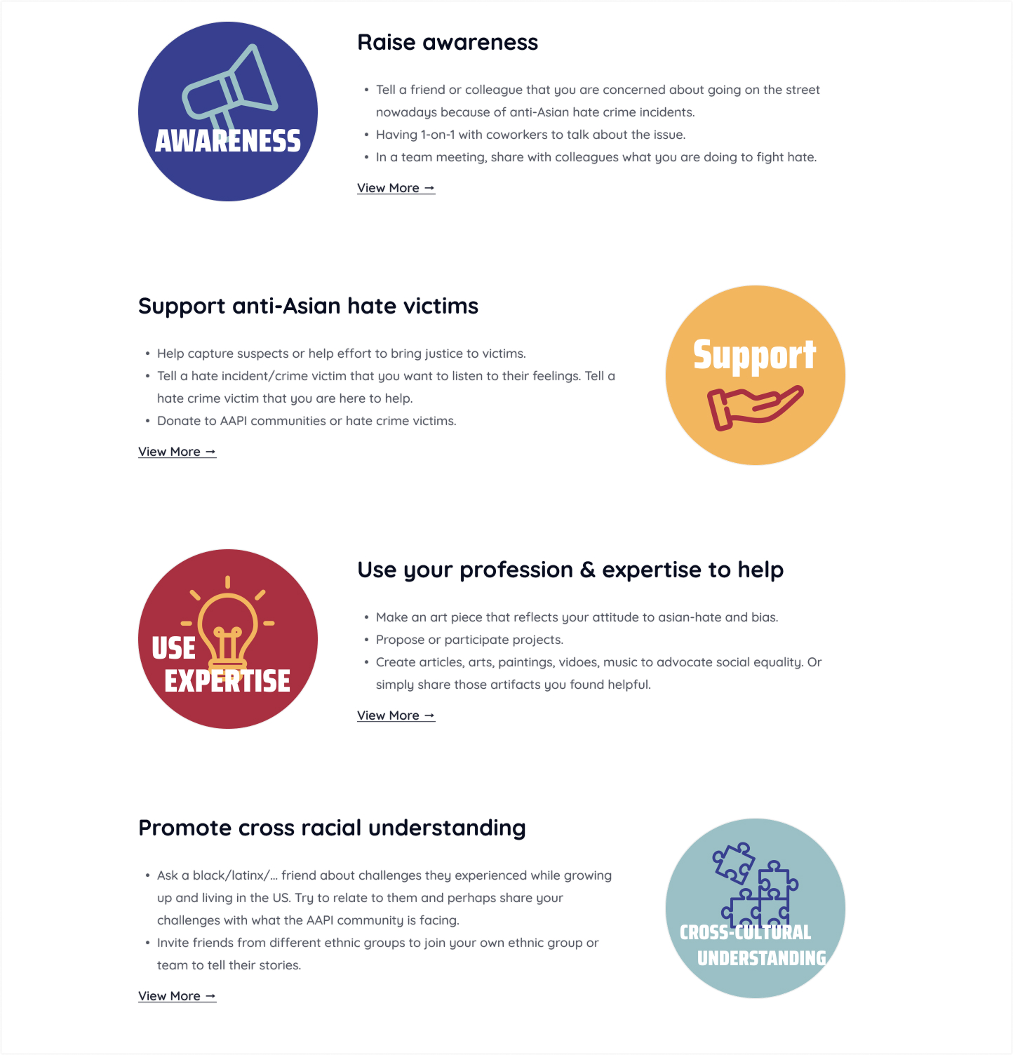
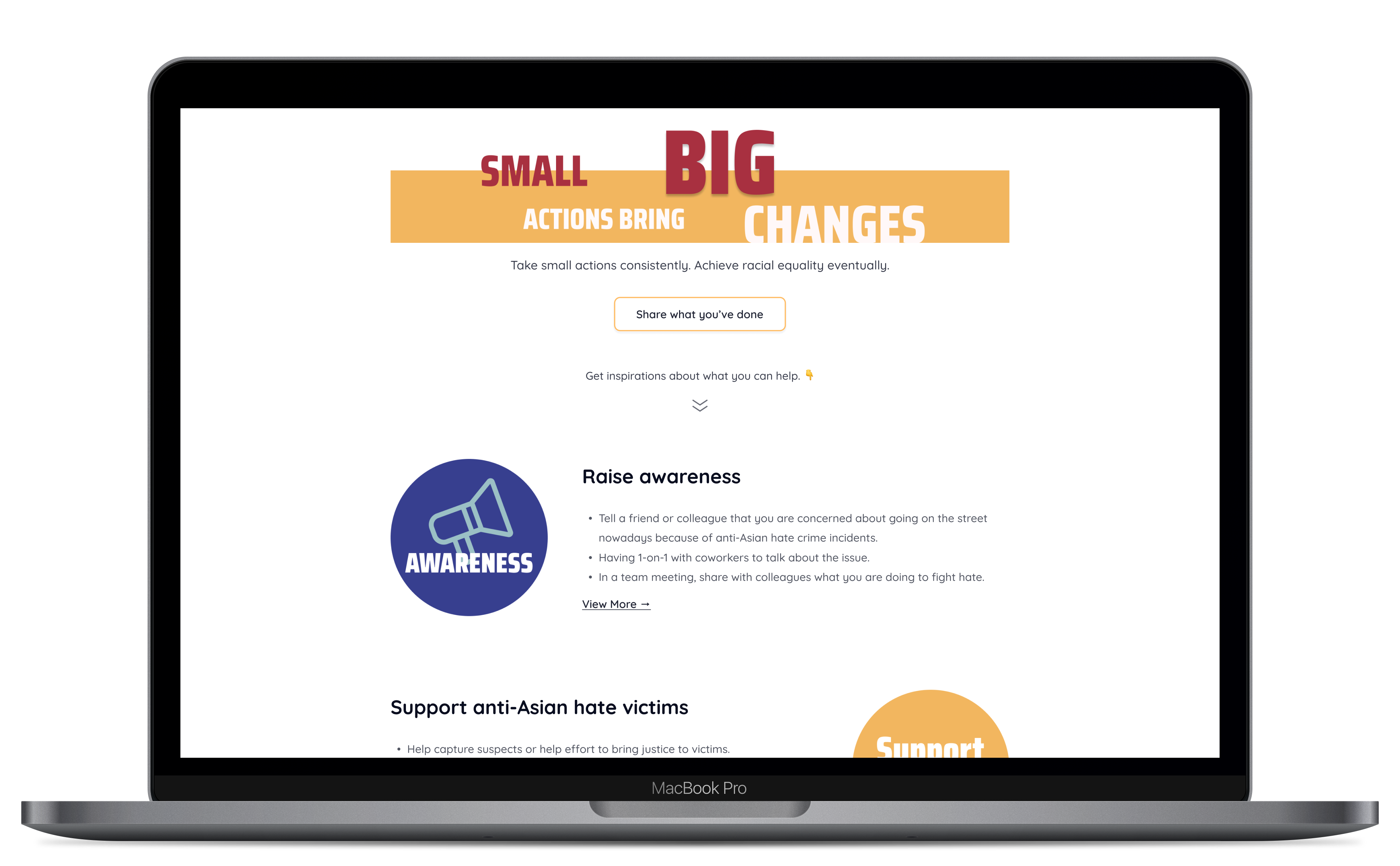
Solution 1
Optimize the use of friendly and approachable visuals.
We tell users we're not an aggresive organization by the use of softer colors and imagery.
Solution 2
Create a community for supporters with educational content.
This is where you learn and connect with other supporters.