What is Brightwheel?
Brightwheel is a childcare management service that offers useful features to both owners and parents.
Brightwheel provides an app that the school staff can use to share photos, videos, and daily activities with
the authorized parents, as well as communicate with them.
Objective
Design a messaging feature that enables parents to communicate with each other.
Learn what privacy concerns parents have and design the app respectfully.
Roles:
UX/UI designer & researcher
Tools:
Figma, Miro, Whimsical, Maze
Challenges
Not all parents are open to sharing their personal or their child's information. How might we provide
controls to protect their information?
Parents have a hard time getting to know other parents in-person. Furthermore, it's also hard to know
which children
belong to which parents.
For the research, I was planning to use three methods: competitive analysis, survey, and user interviews.
Unfortunately it was not feasible to research competitors since I had to be a registered parent or staff member
to use their apps. Furthermore, I decided not to do a survey and just stick with user interviews since
qualitative data matters more for this project. I wanted to know why and how the parents want to get to know
other parents and how sharing their personal and their child's information makes them feel.
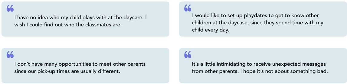
1:1 User Interviews
Through user interviews, I was able to learn the concerns and needs of the parents.
All of the participants were not very concerned about their privacy since their daycare is small. However, some
participants showed concerns about privacy with regards to larger schools.
For this reason, I decided to include the option for parents to hide their information in the app.
Aside from privacy, the majority of participants wanted to get to know
other children and parents.
Here are the major needs and pain points I collected from the user interviews.
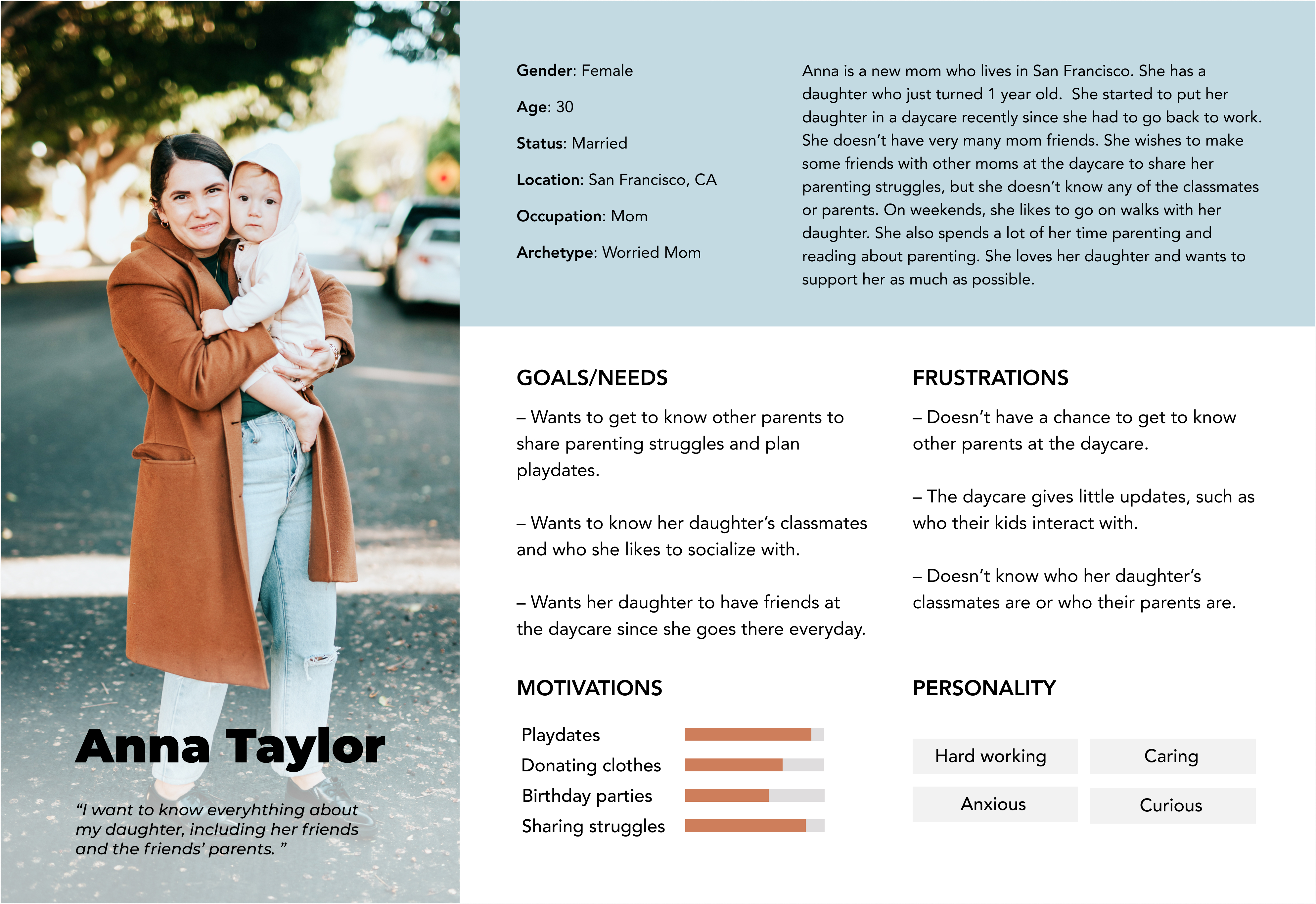
Persona
In order to keep in mind who I was designing this feature for and what I should focus on, I created a
persona to deepen user understandings and empathize with them. I made sure to follow the interview summary
carefully since this persona was important to shape the design of the new feature I'm designing.
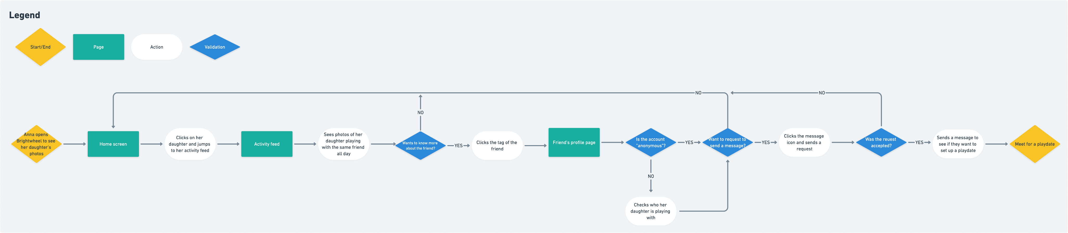
User Flow
I decided to make a user flow to empathize with users in how they would think and take actions to complete a
task. Even though Brightwheel is an app I use every day, I only interact with the staff view, which is different
from the parents view. For that reason and to understand the users (the parents) better, I had to do some some
secondary research to learn how the app works differently. The overall flow turned out to be simple since the
app itself is quite straightforward, which means there are limited complex actions users (the parents) can take.
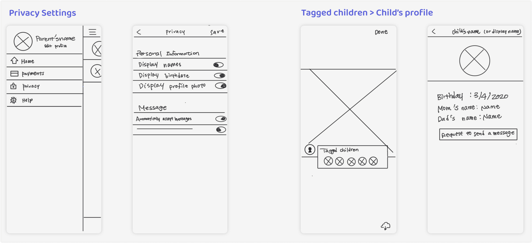
Sketches
Before creating wireframes, I sketched out different ideas to organize my thoughts. I followed the style of app
for the privacy settings to stay consistent. For the tagged children feature, I tried to imitate other social
media apps so that the users are able to adjust to the app easily.
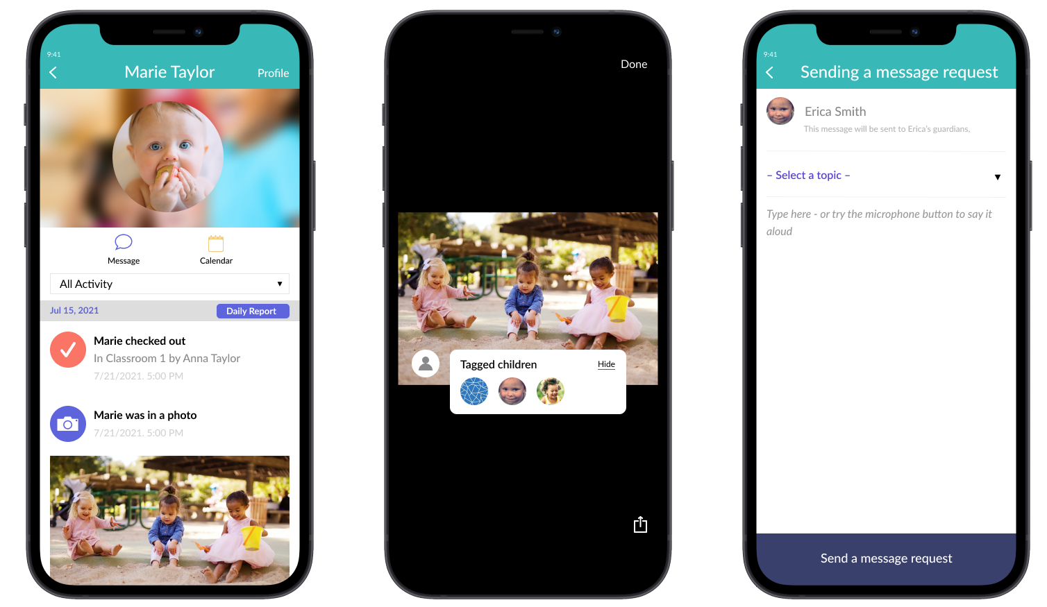
Mid-Fidelity Wireframes
I made wireframes before moving on to hi-fidelity design so that I could focus on the flows for the whole app. I
based these on the sketches and screenshots from the Brightwheel app. I wanted to focus on putting the privacy
settings link somewhere easy to find since it's so important for users. However, the difficult part of this
process was the fact that there are essentially two profiles in one app: the child and parent. In the end, I
came up with the idea of including a link to the privacy settings on the child's profile page. This way, users
can locate it either here or on the main settings page.
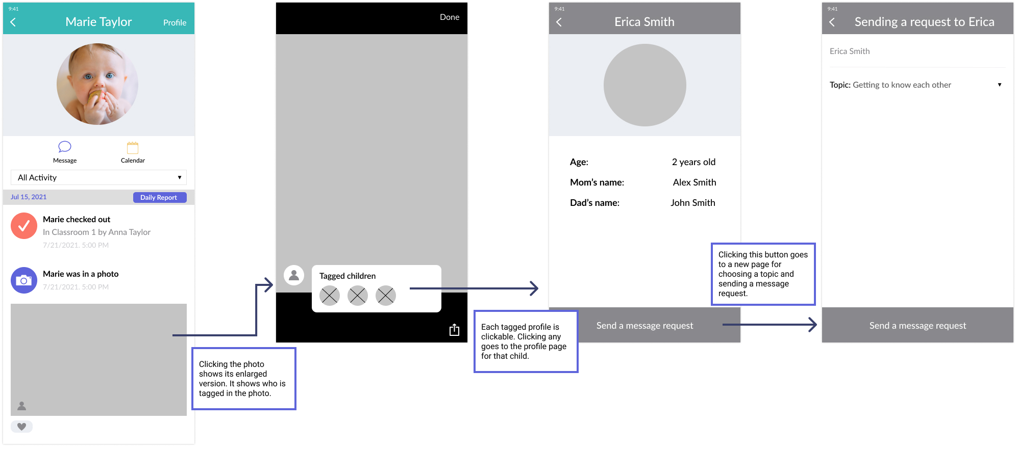
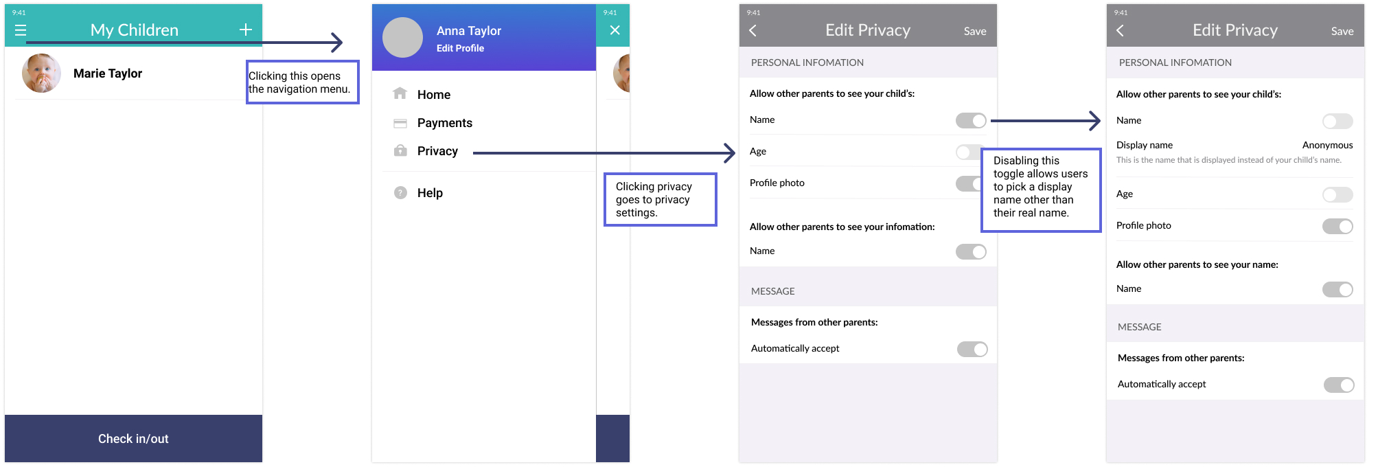
Hi-Fidelity Responsive Design
Once I finished the wireframes, I moved on to hi-fidelity mocks to finalize my designs.
While designing, I paid special attention to match the colors and paradigms in the original design.
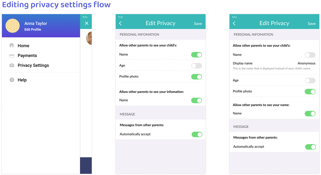
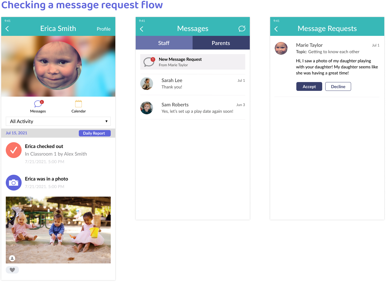
I made three flows for the parent messaging feature: sending a message request, editing privacy
settings, and checking message requests.
I didn't make any major changes from the wireframes since I mainly followed the design of the app. The
only concept that is entirely new to the app is message requests. I researched different message request designs
for
inspiration, trying to make the notification obvious yet suitable to the original design.
Prototype and Usability Test
View Prototype
I conducted usability tests to identify frustrations as well as any additional privacy concerns. I used two
formats:
- Zoom (3 participants who have a child currently attending daycare)
- Maze (10 participants, preferably parents)
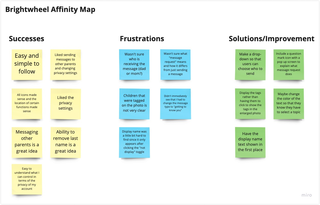
Affinity Map
After the usability testing, I summarized the findings so that I could revise the parts of the design that
made the users frustrated or confused.
I did not hear any major privacy concerns regarding the app and its interface; rather I received comments
concerning other features, such as locking the app.
As this is such a sensitive topic, I agree with these concerns and ideas; however, they are out of the scope of
this project.
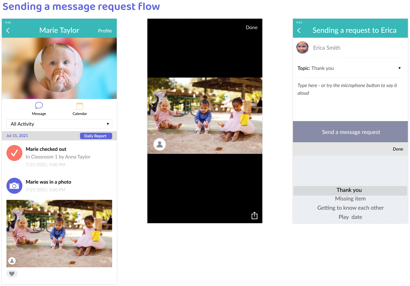
Priority Revision
I decided to make revisions specifically aiming to solve participants' confusion and frustrations from the
usability testing.
Of course, while making these revisions I matched the original design as much as possible.
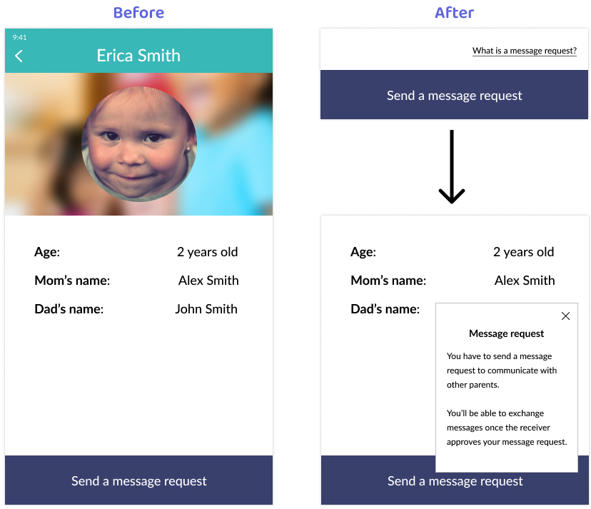
Some participants mentioned that they can guess what the "Send a message request" button does, but
they're not completely sure what it does. I included the text, "What is a message request?". If a user
is confused, they can click this to read about how it works.
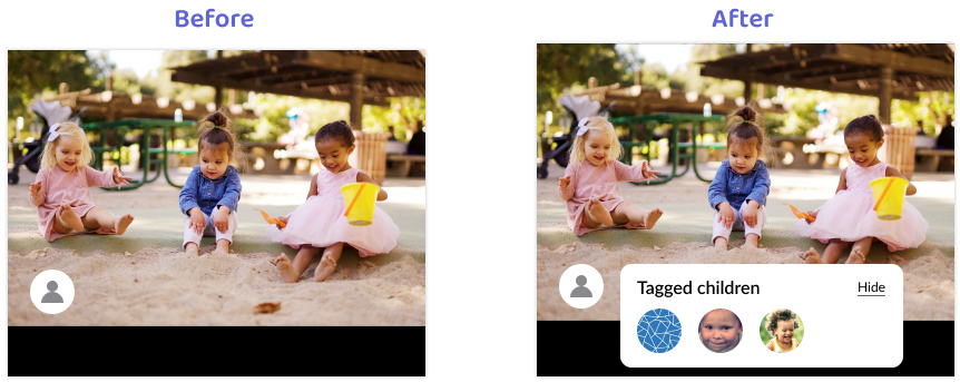
During the usability testing some participants did not realize the tagged children feature existed.
Therefore, I decided to make the tagged children panel shown by default to make it more prominent, while
including a
"hide" button to close it.
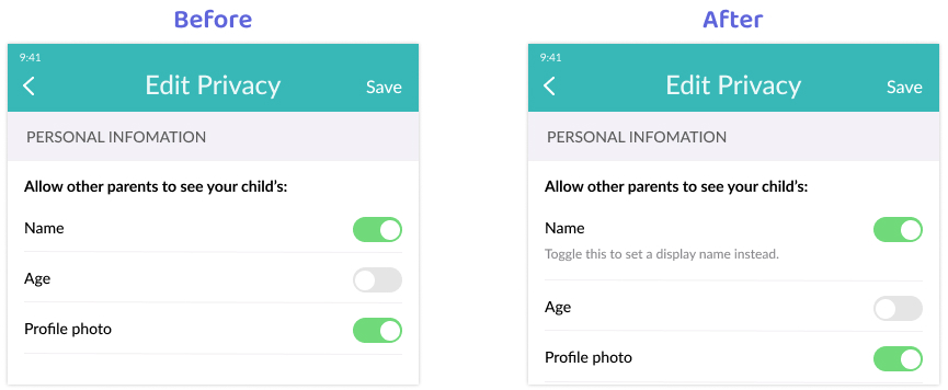
Some participants had a hard time finding the "display name" privacy setting since it isn't shown until
they deactivate the "name" toggle.
I added some help text to inform users how to set a display name when they don't want to share their
real name.
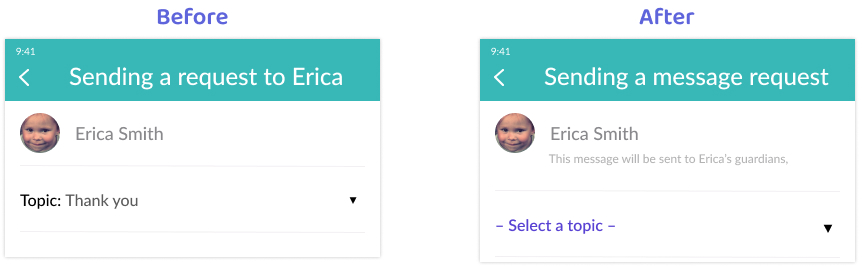
For the message requests, some participants in the usability testing got confused by the required topic
selection.
At first I wasn’t sure how to make it more obvious that choosing a topic is required. I referred back to
the original design and discovered that it uses purple for certain text and more subtle colors for other
text; it also has fewer words.
I decided to change the color and remove the word “Topic” to make it
both look cleaner and more prominent.
I also made the drop down icon larger.
A few participants also mentioned that they didn't know who would receive the request, so I included
some
explanatory text.