All About Matcha
Delivering the Japanese Tea Ceremony experience to your home.
What is All About Matcha?
All About Matcha is a small matcha shop based in Kyoto, Japan that sells matcha and provides tea ceremony
classes on-site.
Due to the Pandemic, they see a need for online business, so they want to expand their business to the
online market.
With the growing reputation of matcha overseas, they would like to put both their products and tea ceremony
classes online.
Objective
Design a hi-fidelity, responsive e-commerce website with virtual tea ceremony class bookings.
Design a logo and establish brand identity for the website.
Client:
All About Matcha (fictional)
Roles:
UX/UI designer & researcher
Tools:
Figma, Miro, Whimsical, Maze
Challenges
Most people have no idea what to bring to a Japanese Tea Ceremony, or what it's all about.
Japanese Tea Ceremony can be intimidating and appear to have strict manners.
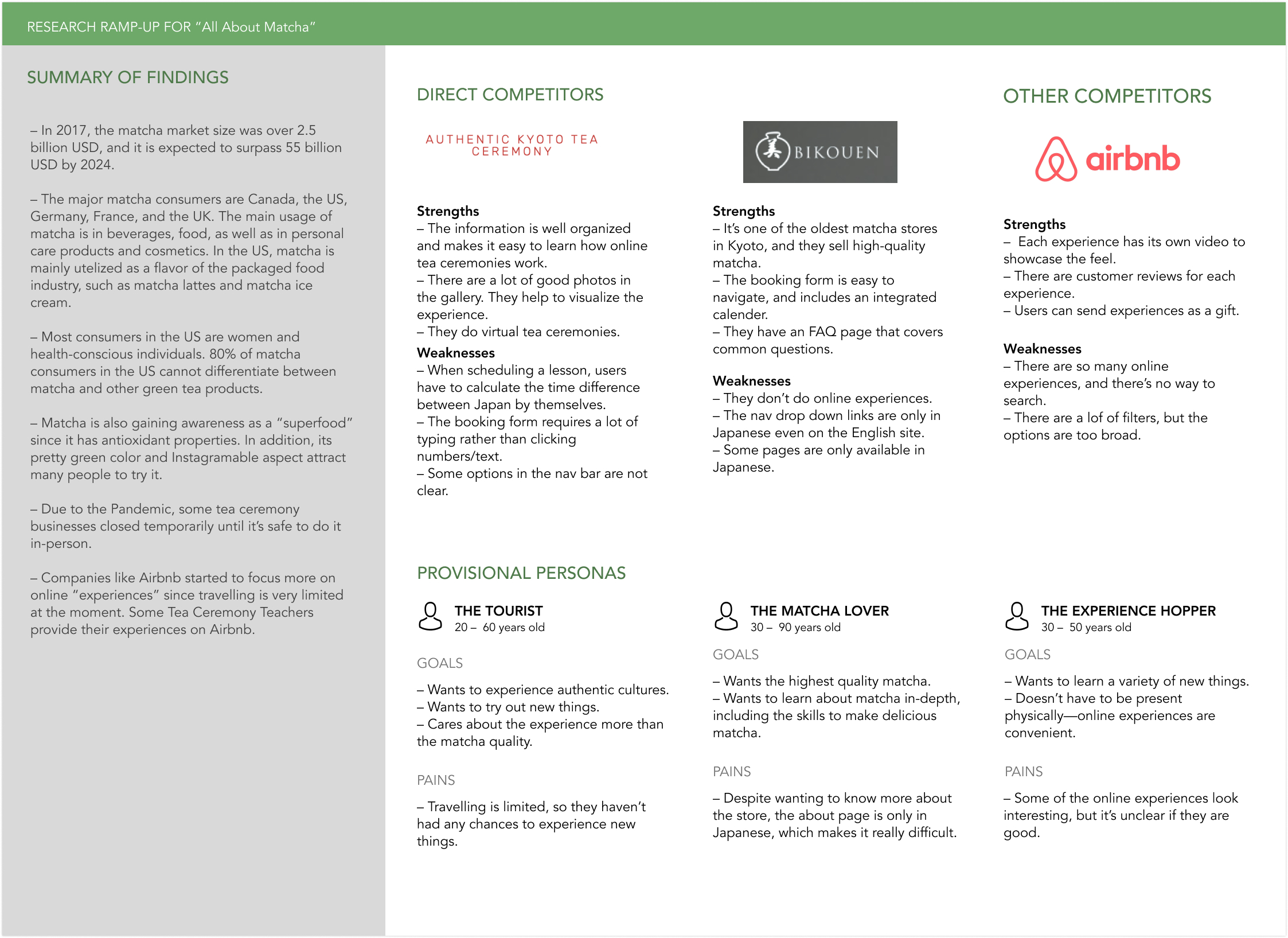
Secondary Research & Competitive Analysis
To begin this project, I did research to understand the matcha market as well as to learn how people perceive
matcha.
I learned that a) matcha consumption is increasing as a superfood and b) the majority of people associate
matcha with ice cream, desserts, or lattes.
For the competitors, I picked companies that provide tea ceremony lessons or online experiences to see how they
set up their booking processes.
The commonality I observed is these matcha shops are usually small businesses (Authentic Kyoto Tea Ceremony and
Bikouen), and their websites are
centered around a beautiful UI (images) to impress the users, rather than UX.
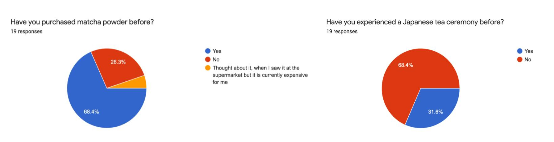
Survey
I conducted a survey to get overall impressions about matcha and Japanese Tea Ceremony.
The majority of participants associated it with forms of desserts and drinks, corroborating the competitive
analysis.
For Japanese Tea Ceremony, I made an assumption that people associate it with strict manners and
a sophisticated atmosphere, so I wanted to get quantitative results from the survey.
My assumption was fairly correct, while a few people said that it would be a relaxing and peaceful experience.
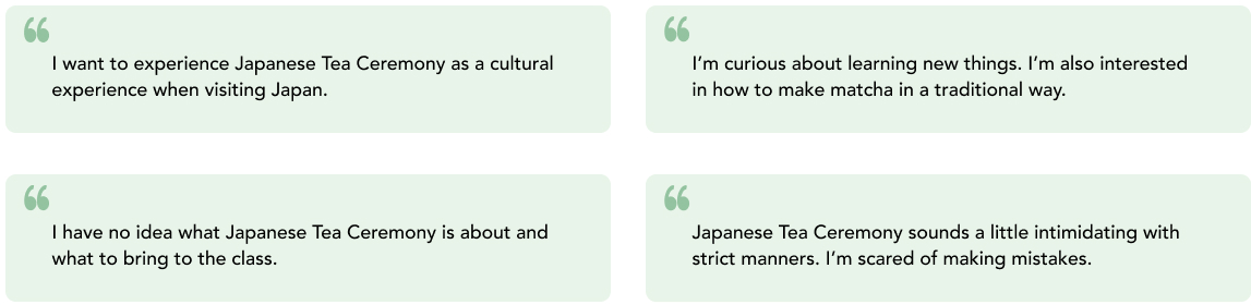
1:1 User Interviews
I conducted user interviews to dive deeper into the topic and find needs and frustrations. I recruited 6
individuals who like matcha to hear their feedback about matcha and Japanese Tea Ceremony. I learned that the
majority of people would
seek out Japanese Tea Ceremony as a cultural experience when they were in Japan or if they had the chance.
However, a few participants (those who have lived in Japan before) said they would like to learn more about it.
I decided to target those who would seek it out when given the chance, since they represent the majority
of potential users in the United States.
Here are the major needs/pain points I got from the user interviews:
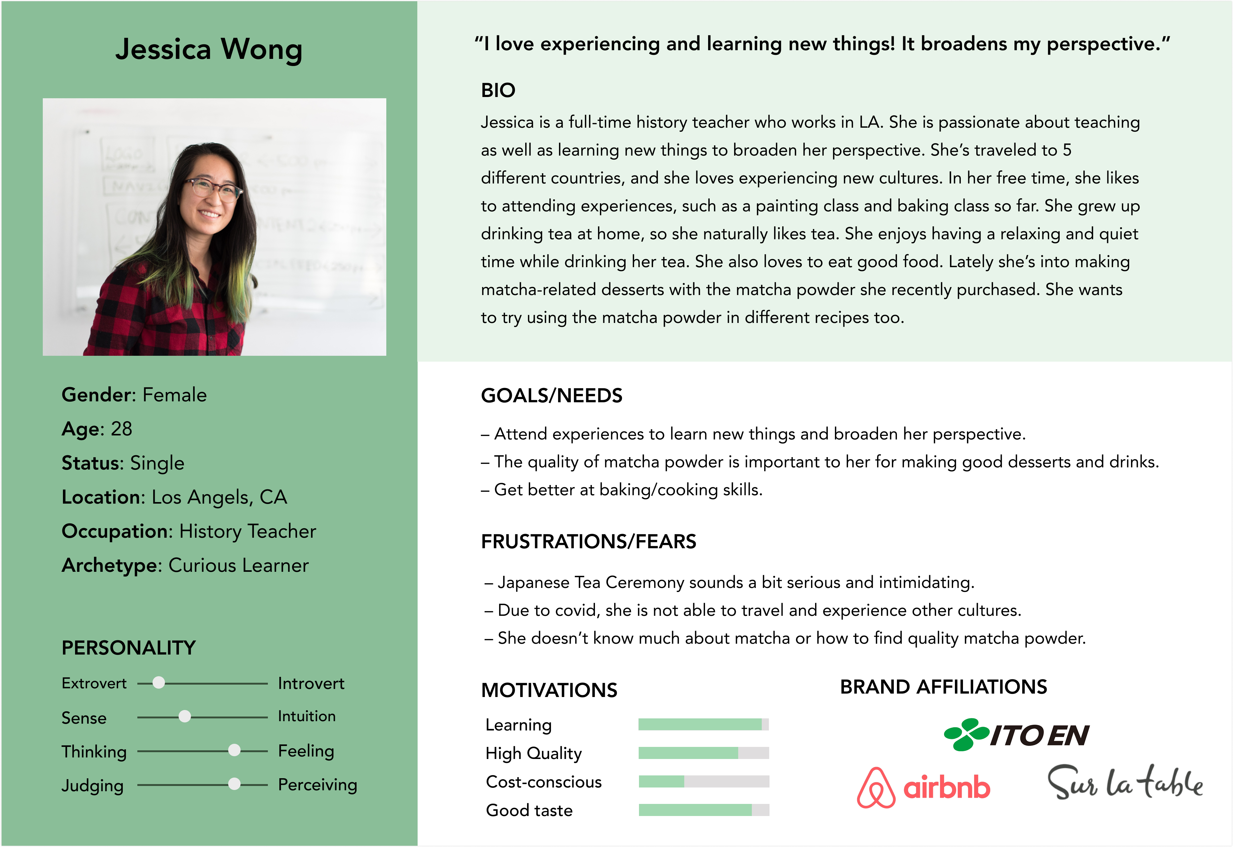
Persona
To empathize with the users and remember their needs, I created a persona that
represents a core user. At first, I was thinking that my target users are people who appreciate
attending Japanese Tea Ceremony and drinking matcha as it is. However, I learned through my research
that liking matcha doesn’t mean they would attend a class to get better at making matcha, but rather to learn
about a new culture.
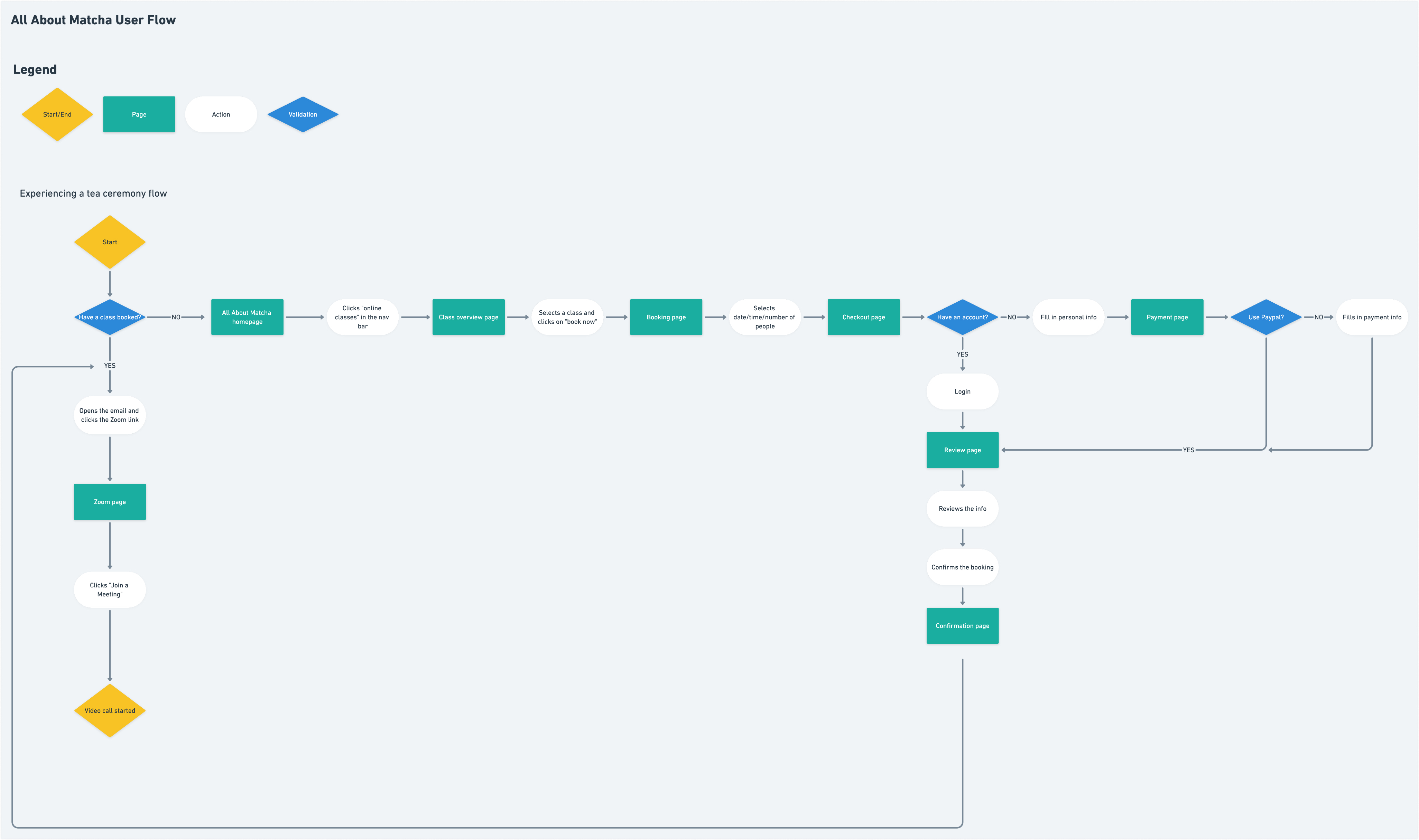
User Flow
After defining my persona, I created a user flow to visualize the paths that users would take to book a
tea ceremony class.
This reference helped me decide what to include and emphasize on the
website as well as design the website with specific user tasks in mind.
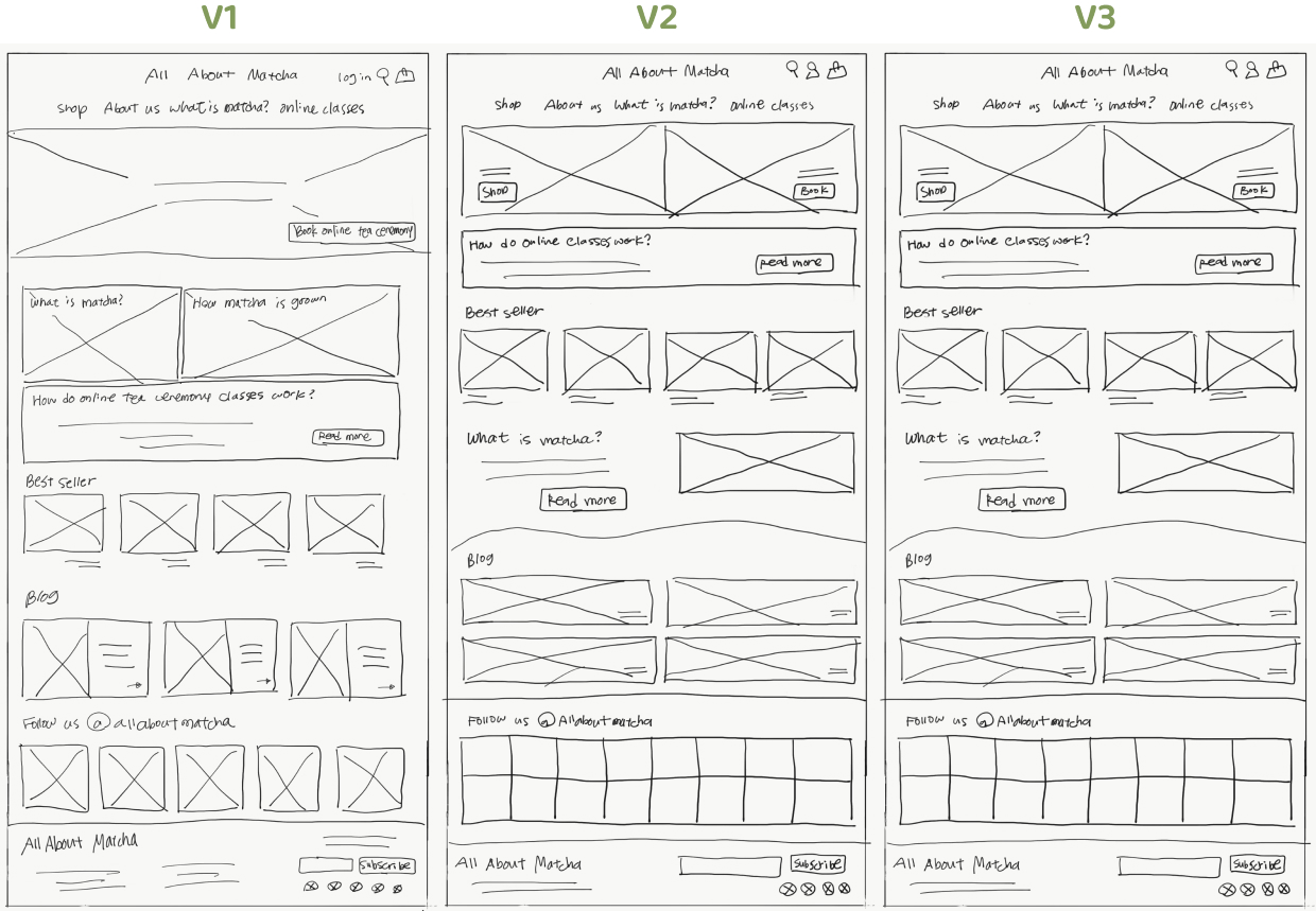
Sketches
In order to have a sense of how the website will look, I decided to sketch out my ideas before moving on to
wireframes.
I focused on the two core areas of the business: matcha e-commerce and online Japanese Tea Ceremony classes.
Additionally, I kept in mind findings from the research.
Since people tend to only associate matcha with desserts or drinks, I included information about other aspects
of matcha for users to read about.
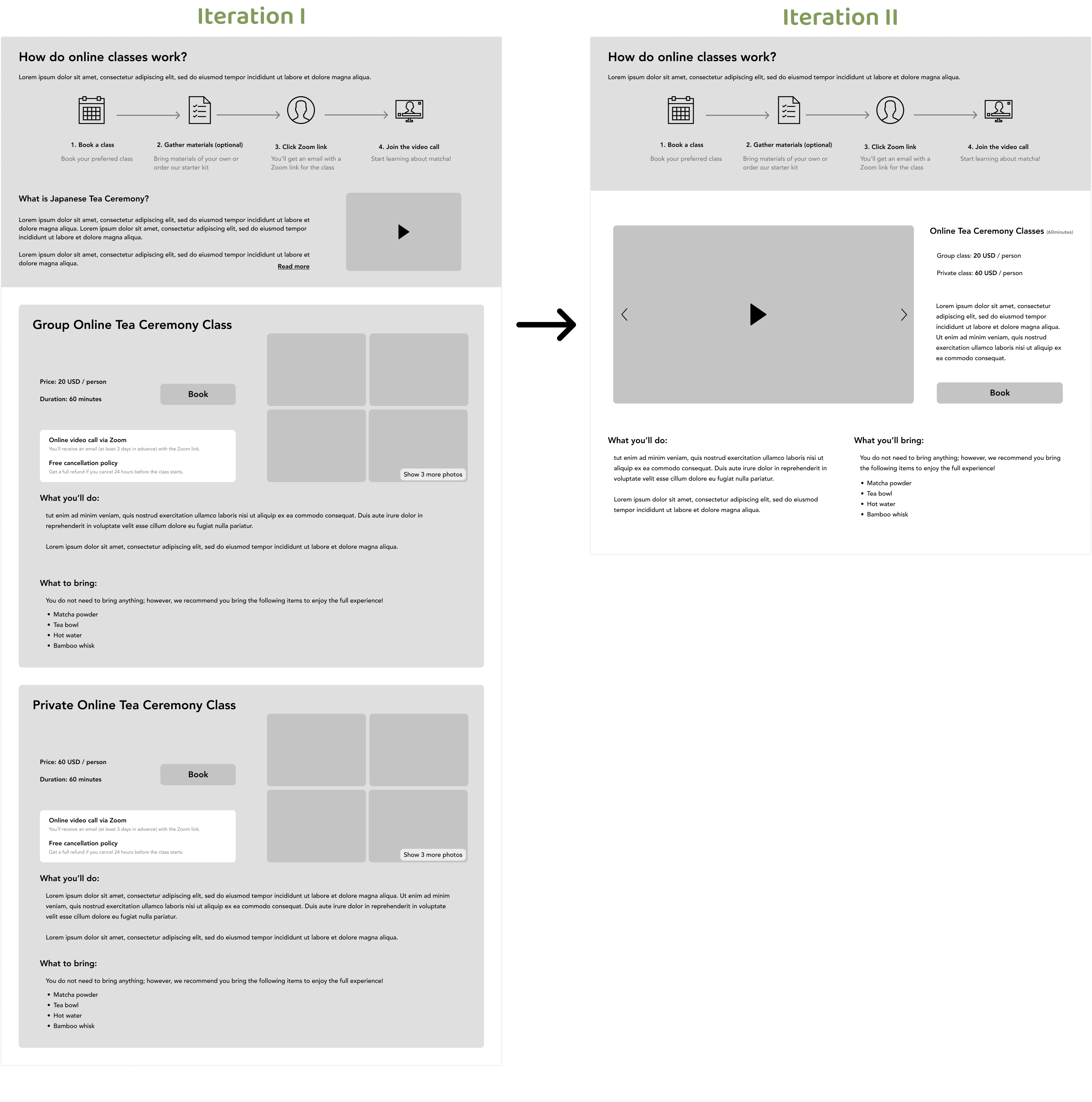
Mid-Fidelity Wireframes
Next I moved on to wireframes. Here I mainly focused on the booking flow so that users will
be able to have a smooth experience.
In the competitive analysis I found that the direct competitors (Authentic Kyoto Tea Ceremony and Bikouen) each
have a cumbersome form.
To improve on this, I made the booking process click-based, and require almost no typing. Click, click, click,
checkout ✨.
After the first iteration, I realized the website was overloaded with too much information about matcha.
I decided to remove the unnecessary elements from the main page, to make sure that users don't get lost.
After my first cleanup, there were still many pieces of information which made the main page look cluttered, so
I iterated on it again.
In the end, I was able to streamline the design to be simpler and have less information in one page.
At first there were two containers for private and group classes.
However, I realized these two are almost the same except for the price and a few other details. I decided to
combine
them into one section so that it fits into one viewport and removes duplicate information, allowing users to
more quickly understand the differences.
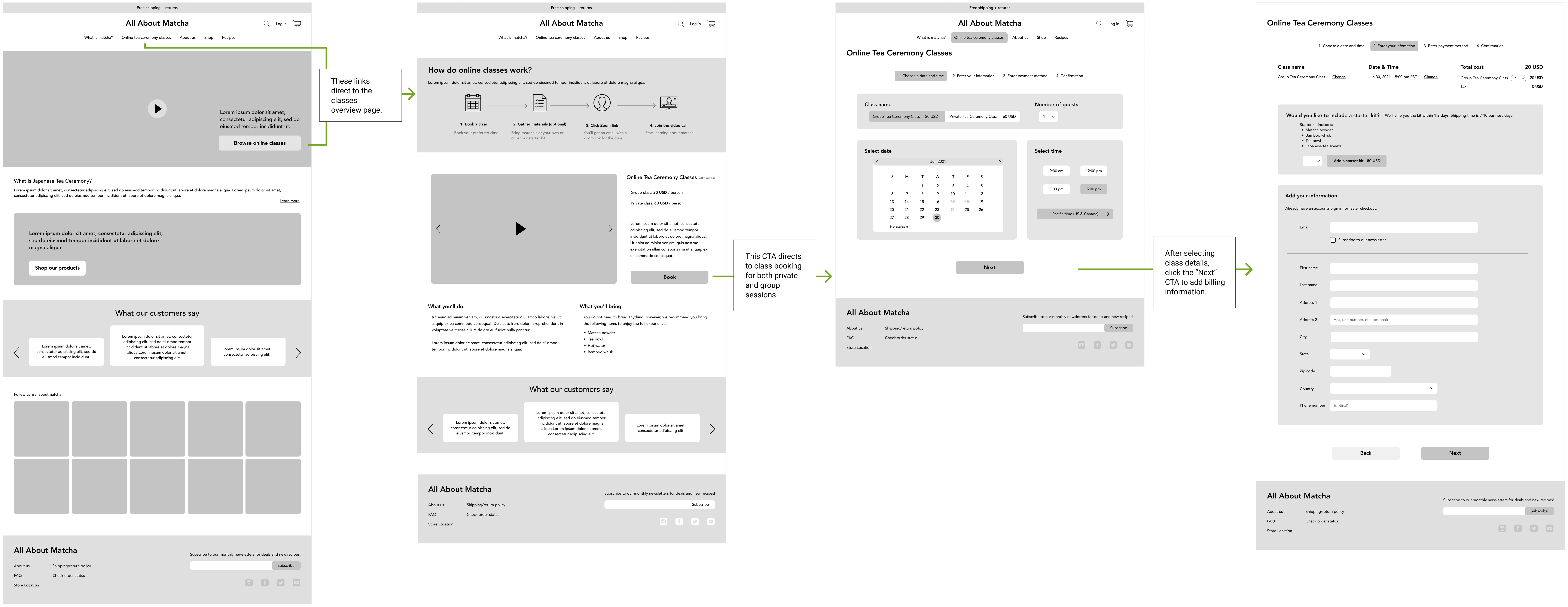
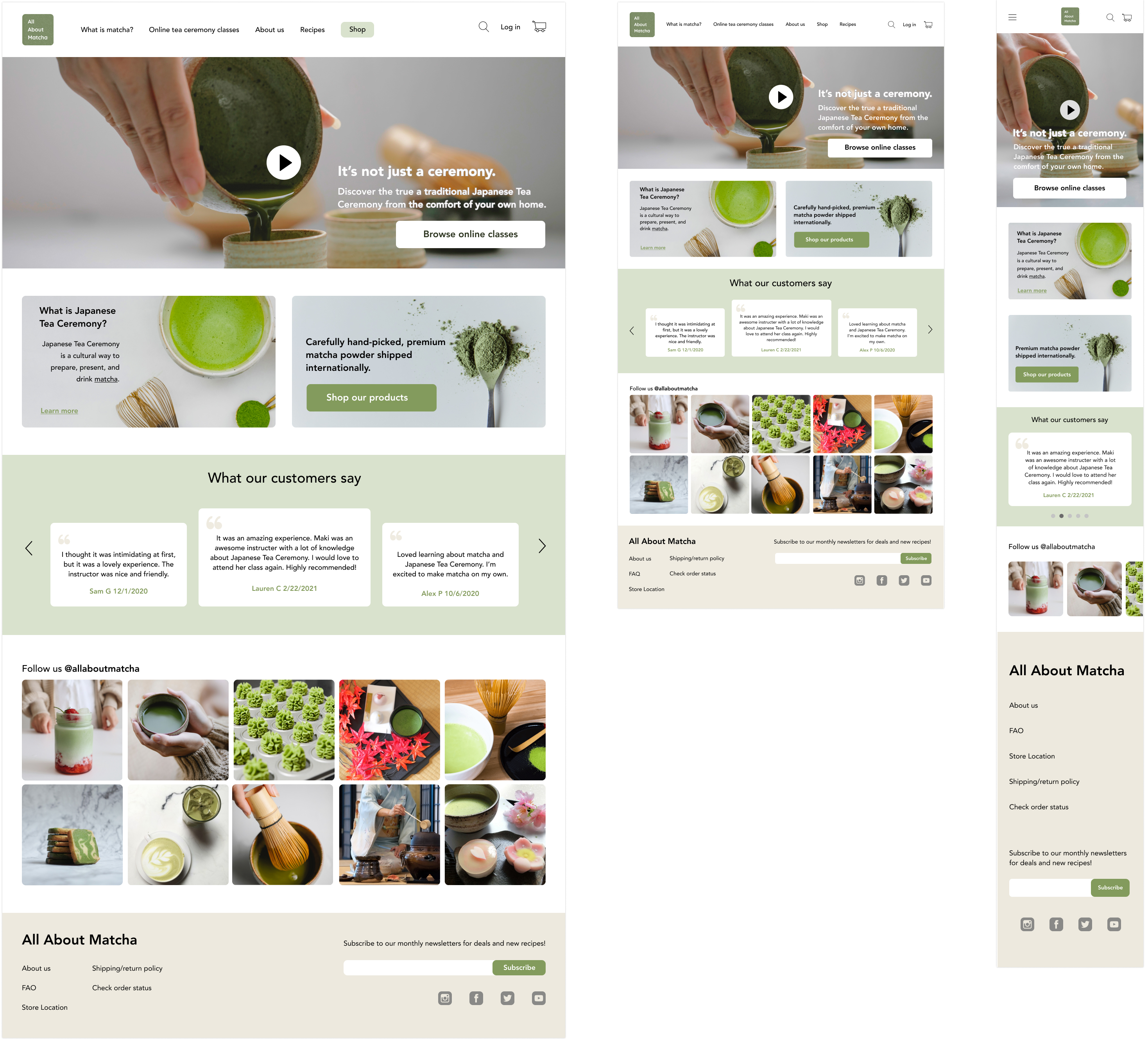
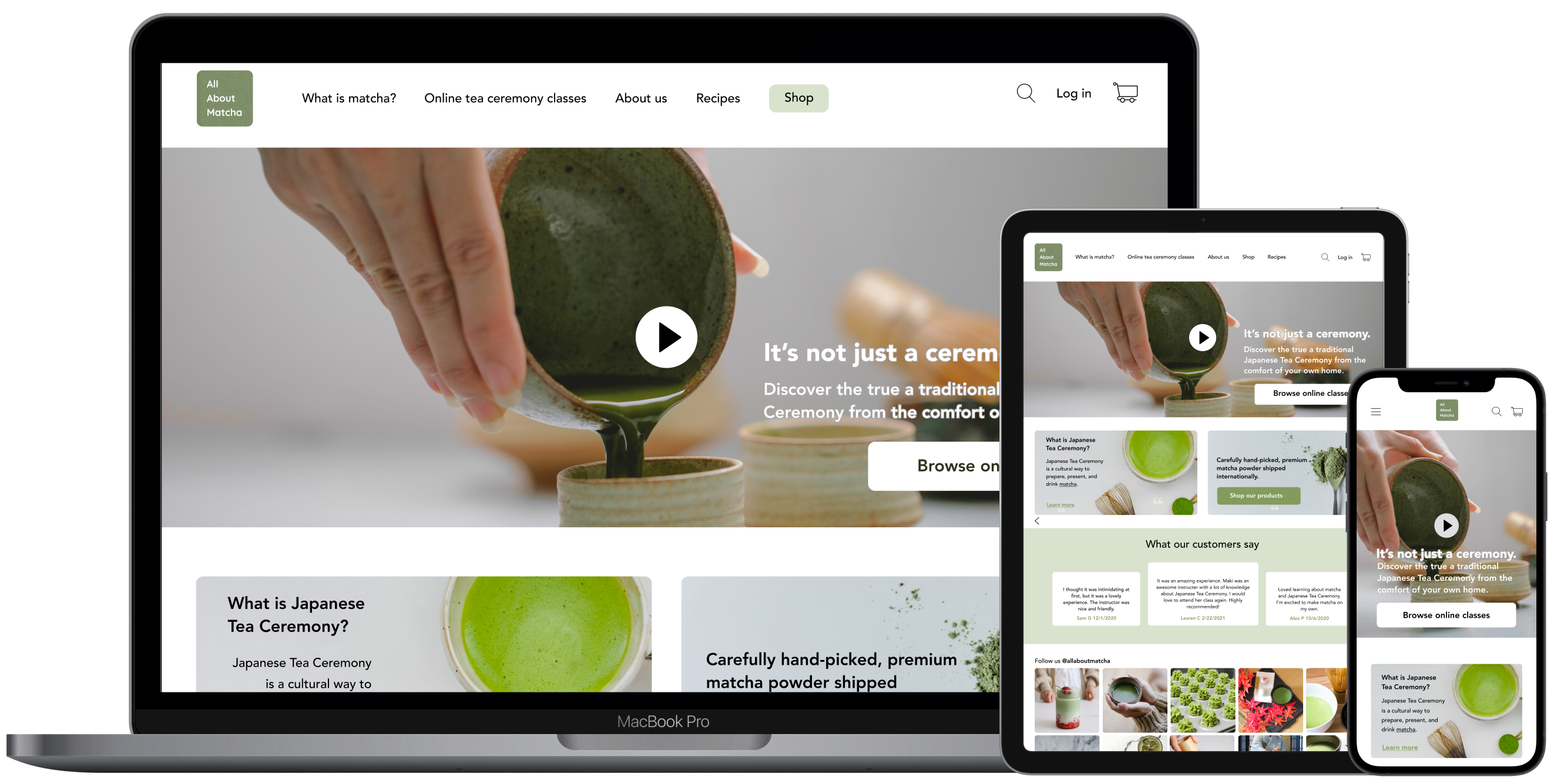
Hi-Fidelity Responsive Design
Next I created hi-fidelity designs based on the wireframes. I decided to change the layout of the main page
since it
looked text-heavy.
At first I kept all the text since I thought it's important for users to know what matcha is, but
I realized people would just skip it if they are not interested. I ended up making the
text much shorter and gave users the option to read more.
I avoided making the website look too sophisticated since Japanese Tea Ceremony itself is already intimidating.
To achieve this, I used soft and friendly colors rather
than
black, which a lot of matcha businesses do. Still, the images leave a hint of sophistication which shows the
beauty of Japanese Tea Ceremony.
Prototype and Usability Test
View Prototype
I conducted usability tests to identify any frustrations/confusion users might have during each interaction, and
whether it inhibits users from performing certain tasks. My main concern was whether the booking form and
starter kit were clear to the users.
- Zoom (3 participants)
- Maze (10 participants)
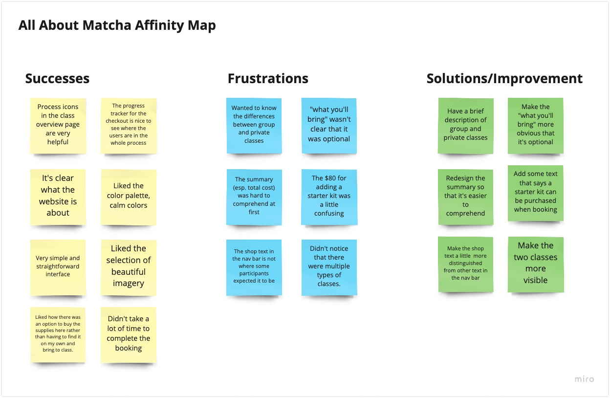
Affinity Map
I synthesized the results, which mainly contained feedback about the tea ceremony classes and booking process.
After grouping the successes and failures, I came up with solutions and improvements for each issue.
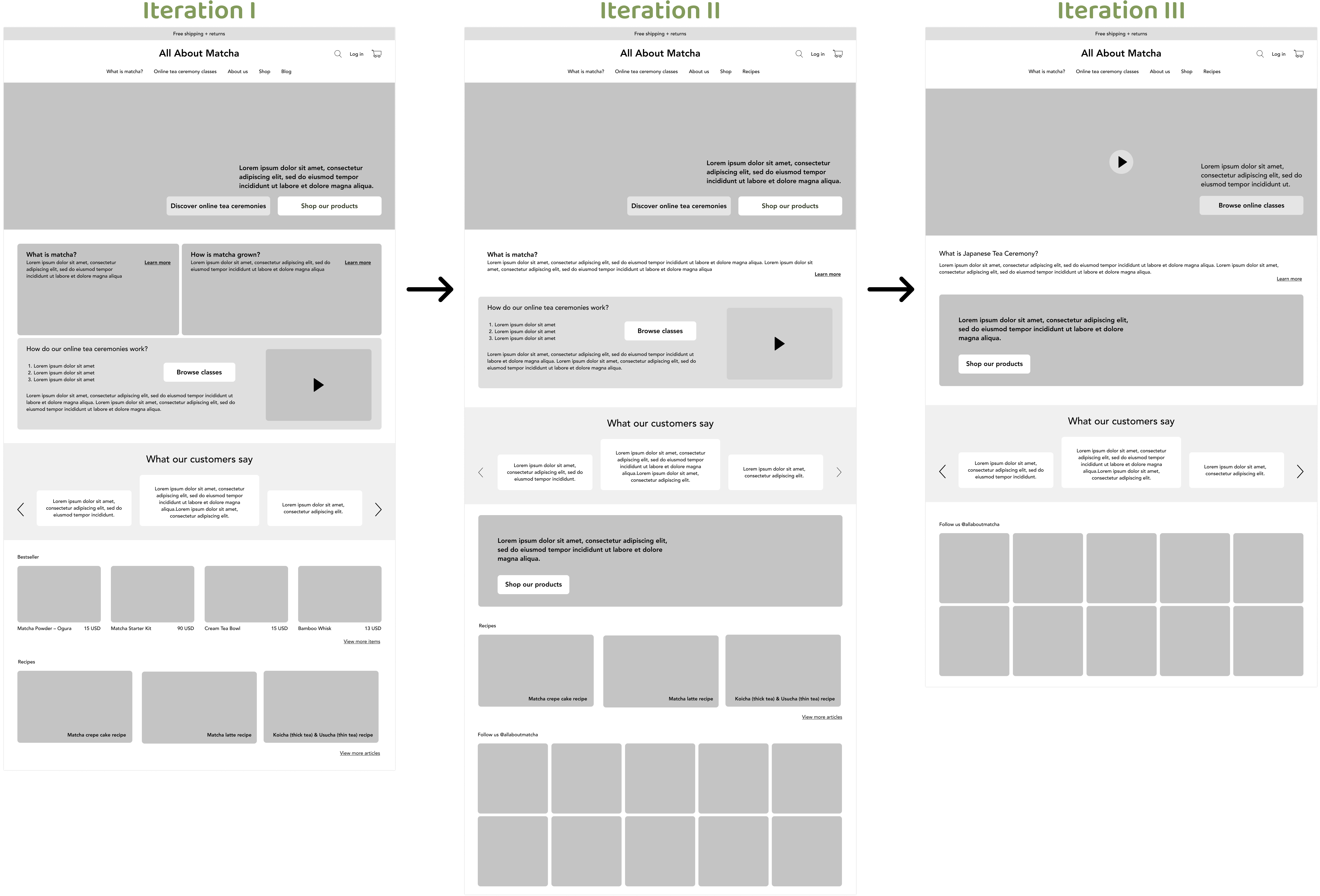
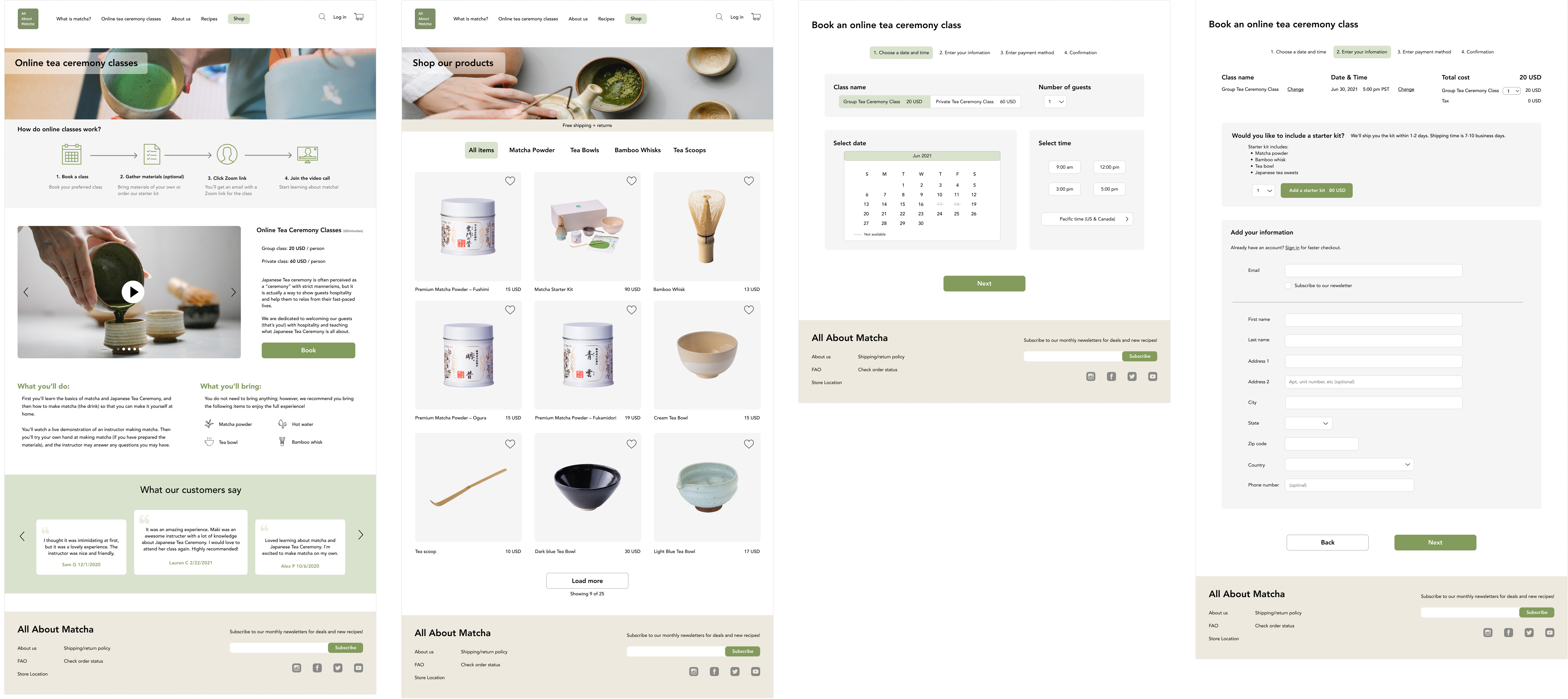
Priority Revision
After analyzing what makes users frustrated or confused, I made revisions based on the
solutions/improvements in the affinity map.
Some participants in the usability test mentioned that the shop page was hard to find.
I decided to highlight the "shop" text in the navigation bar to make it easy to find.
In addition, it's important to equally promote the matcha e-commerce since the website content is mostly
about the tea ceremony classes.
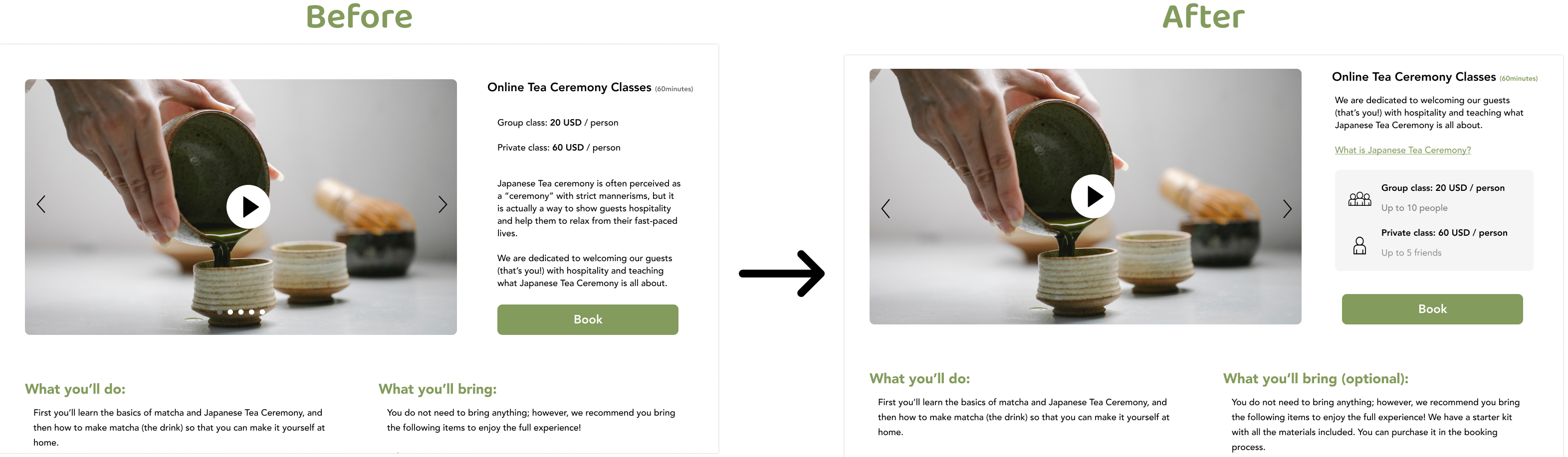
One frustration that came up in the usability testing is that the two class types are hard to understand,
buried within a long description.
To solve this, I removed the description text and included a link, "What is Japanese Tea Ceremony?" for more
info.
I added icons to differentiate the group and private classes so that users can visualize what they are.
The text is short and simple, yet it accurately describes the differences between the class types.
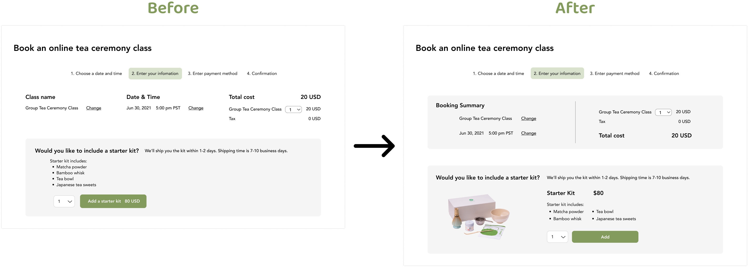
Many participants were confused about the summary because they had to read everything carefully to understand
it.
To make it simpler, I created a container for the booking summary, removed unnecessary text, and improved
spacing.
For the starter kit, I included a photo of the starter kit so the users can visualize what they are ordering.
Assumptions could be correct or incorrect–it's important to verify them with research.
Having visuals, such as icons and images, make a big difference in helping users navigate the website.
Icons and images also help the users expect what things mean without reading the text.
Having a lot of information doesn't always mean it's helping the users–it could result in making the users
confused.