💡As the project was in Japanese, the majority of the
deliverables are also in Japanese. 💡The visual design is based on the provided design by the
client.
What is SkyHub?
Skyhub is a grocery delivery website that offers users the convenience of having their groceries delivered
by drones. Skyhub aims to provide a new website catering specifically to seniors aged 75 and above.
Roles:
UX/UI Designer & Researcher
Team:
Kotomi Cogdill, Product Manager, Developers
Duration:
4 weeks
Tools:
Figma, Notion
Background
Skyhub works with Kamishihoro city hall in Hokkaido, Japan, which has been implementing programs
to support seniors, including a specialized bus booking system. The city hall distributed tablets to
some households and approached Skyhub to develop a user-friendly grocery delivery website accessible on
these iPads, aiming to enhance services for seniors.
Persona
This website is primarily designed for a specific demographic, with about 10 users in the initial phase.
Here are some characteristics of the intended users.
Challenges
In general, senior citizens may not be familiar with using digital products. Therefore, it is expected
that they may encounter challenges when navigating regular grocery delivery websites.
How might we help seniors shop groceries online smoothly independently?
Solution
Make the flow linear with forward and backward navigation only.
I emphasized having minimal features on each page and implemented a step-by-step process
01. Discover
As the problem scope was quite specific and no competitors were found, I read several articles to gain an
understanding of the fundamental requirements when designing for senior users.
Here are some main findings:
Avoid using components like scrolling and drop-down boxes, as seniors may not be familiar with these
concepts.
Pay attention to text sizes, colors, and other visual elements to ensure visibility for seniors with
potential vision impairments.
Incorporate familiar elements from real life to enhance seniors' understanding and ease of use.
1:1 User Interviews
Once I grasped the general requirements and considerations, I decided to delve deeper and gather real user
feedback to gain a better understanding of their needs and preferences.
Here are the major needs and pain points I collected from the user interviews:
02. Define
User Flow
After gaining a comprehensive understanding of the user needs and pain points through my research, I focused
on determining the specific details of the user flow. I ensured that the flow remained linear, allowing users
to navigate either forward or backward. However, on the cart page, I provided flexibility for users to modify
order details if needed. This feature also enables them to correct any mistakes they may have made while adding
products.
03. Design
Sketches
To visualize and consolidate my ideas, I created sketches of the main screens. I chose to design the flow as
a
linear process, avoiding branching out to different pages with distinct functions. This approach allows
users to
proceed either forward or backward, simplifying the navigation options.
Mid-Fidelity Wireframes
To ensure that the site was user-friendly for seniors, I made sure to:
Eliminate features like recommendations found on regular grocery delivery sites to prevent
information
overload.
Organize features into separate pages to enable seniors to proceed step-by-step.
Design a linear process instead of branching out to different pages with different functions.
Hi-Fidelity Design
Incorporating the client's request for visual design consistency with their existing bus-booking website, I
integrated the following research findings into my design approach:
Ensuring that text sizes are larger than 18px, colors are chosen appropriately, and other visual elements
are
designed to be easily visible for all users.
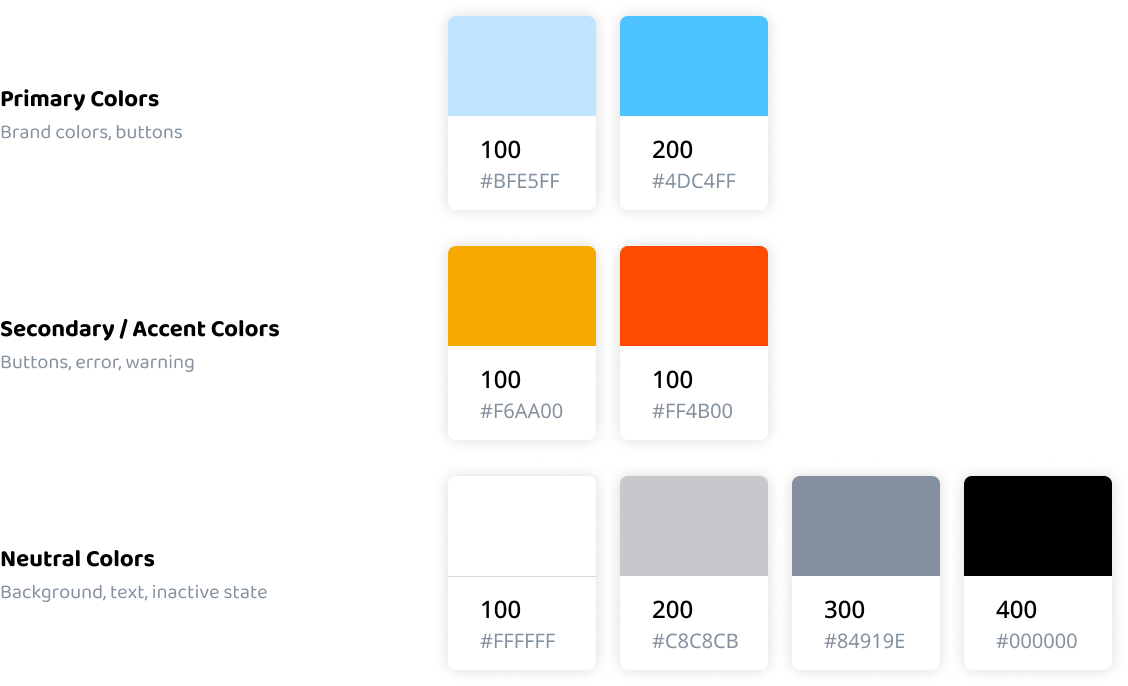
I selected a color palette from the
Model Color Palette for Color Universal Design Guidebook, the guidebook made
for accessibility.
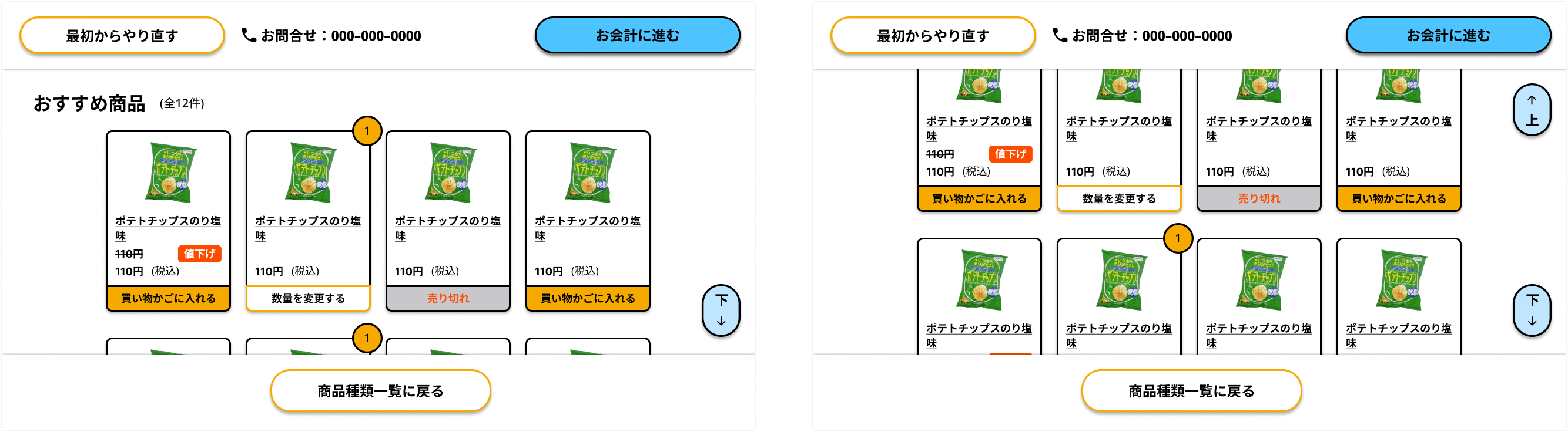
I included "up" and "down" buttons to assist users who may not be aware of the scrolling functionality,
enabling them to navigate the page vertically.
I have included a button (orange button on the left) that allows users to restart their navigation in case
they
get lost at any
point while using the website.
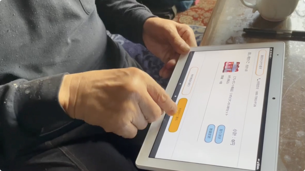
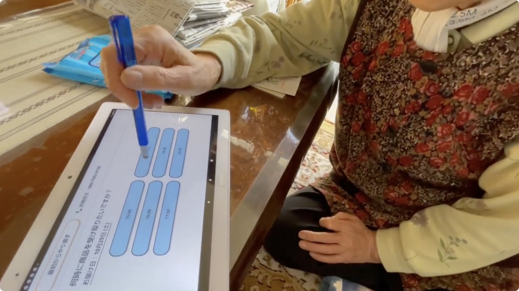
04. Test
Prototype and Usability Test
After completing the high-fidelity design, I created a final prototype and presented it to Kamishihoro City
Hall. I requested that real users be involved in the process, and we were able to have a few seniors test
it.
Although I was unable to attend in person (as I work remotely), my project manager kindly conducted the
usability test on my behalf.
Here are the findings:
Overall, the flow was easy to use, and there weren't any major issues. Users appeared to be able to
make
full use of it once they became familiar with it.
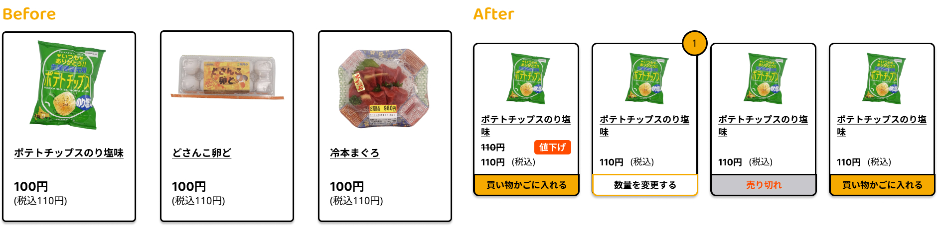
I had underestimated the users' familiarity with digital products since they were already using the
bus
reservation system. Several users preferred being able to add items to the cart directly from the
product list instead of being taken to a product page.
Considering that the majority of users indicated a preference for adding items from the product list,
I've
updated the design to allow them to directly add items.
Here is a video showcasing the final test, illustrating the entire process from ordering to delivery by
drones.
Takeaways
Although the target users were completely different from my generation, I succeeded in empathizing with
them
and creating a product that they could easily use. I truly realized the power of research in the
process, as
I would not have been able to accomplish this without it.
I enjoyed every step of the process and put a lot of thought into the users' needs. I wanted to ensure
that
seniors didn't feel limited by their age and ability to use digital products. I'm thrilled with the
results
and am grateful for the opportunity to help improve their confidence through my design.
 I included "up" and "down" buttons to assist users who may not be aware of the scrolling functionality,
enabling them to navigate the page vertically.
I included "up" and "down" buttons to assist users who may not be aware of the scrolling functionality,
enabling them to navigate the page vertically.